
Table of Contents
OVERVIEW
This chapter presents and discusses a brief overview of the three major groups or types of graphics. It is important for instructional designers to understand these groups because they represent the types of graphics most often used in instruction. Discussed next are issues in applying these graphic types to instruction. The first step in this process is identifying the desired learning outcome. The chapter presents an overview of possible learning outcomes, called domains of learning. Finally, five instructional applications of graphics are presented according to the instructional function that each serves. In order to be effective, the instructional function of any graphic must match the particular needs of the lesson.
OBJECTIVES
Comprehension
After reading this chapter, you should be able to:
Application
After reading this chapter, you should be able to:
Though prescription is usually the desired goal in instructional design, description is a necessary starting point. For this reason, this chapter provides an important beginning in describing how graphics are used in instruction. First, this chapter will describe an overview of the groups or types of graphics typically used in instruction. These groups are fundamental to understanding the concepts in the remaining chapters.
The design of all effective instructional materials, including graphics, starts by defining the goals of the lesson and the nature of the learning tasks and materials. For this reason, the second part of this chapter will describe the range of learning outcomes that instruction usually addresses. Finally, this information is used to generate an informal guide to instructional applications of graphics. This guide not only provides a simple way to describe the role of graphics in instruction, but it can be used for prescriptive purposes such as those presented later in the book.
THE THREE TYPES OF INSTRUCTIONAL GRAPHICS
Given the popularity and flexibility of graphics in instruction, a way is needed to make sense out of how they can be used to improve instructional materials. First, there is a need to describe the types of graphics commonly used in instruction. Second, there is a need to describe the various functions of each type when applied in an instructional or training setting. We will use a simple classification system that describes the types of visuals commonly used in instruction. These categories describe, in general, how graphics convey information and meaning, but do not speak directly to how they can be applied in instruction. Applying these graphics types to instruction is a separate issue and will be addressed later. The three types of graphics are classified as representational, analogical, and arbitrary (Alesandrini, 1984), as shown in Figure 2.1.
Representational Graphics
Representational graphics share a physical resemblance with the object they are supposed to represent. For example, a passage of text explaining the purpose and operation of a submarine probably would be accompanied by a picture of a submarine. Representational visuals range somewhere between highly realistic and abstract.
The most common examples of realistic representational visuals are photographs or richly detailed colored drawings, the latter of which are currently the highest quality images that can be generated on microcomputers. Multimedia systems present opportunities to incorporate near-photographic images, such as composite video images taken from videodisc or videotape players, or from computers with adequate memory. Although many would argue that the quality of these video images is much lower than photographs, the issue of representational integrity is largely a function of the context. For example, although most microcomputers could represent a realistic enough submarine for most purposes, the same quality would hardly suffice for an art lesson in which fine details of the Mona Lisa are featured and discussed. Actual photographic images can be made available in multimedia systems that integrate slide/tape projectors (Pauline & Hannafin, 1987).
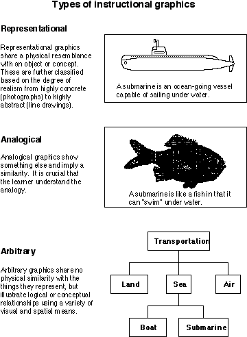
Figure 2.1
The Three Types of Instructional Graphics
An example of an abstract representational visual is a line drawing. These also range in quality from richly detailed to rudimentary drawings. For example, Figure 2.2 shows an example of a passage explaining the use and function of an astronaut's space suit. While it is clearly a line drawing, it was produced from a photographic original. On the other hand, Figure 2.1 shows a rather crude drawing of a submarine. This primitive drawing still captures the most salient features of a submarine. In fact, the lack of interesting details and background makes it easier to focus on the essential characteristics of a submarine and far less likely to get confused or distracted by extraneous details. For these reasons, simple line drawings are often considered better learning aids than realistic visuals, especially when the lesson is externally paced, such as in films and video (Dwyer, 1978). The issue of realism will be discussed in more detail in chapters 5 and 7.
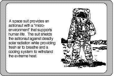
Figure 2.2
Snapshot of a CBI lesson using a presentation graphic consisting of a representational line drawing.
Analogical Graphics
The range of representational visuals is probably the most common type of illustration used in instructional materials today, including computer environments. However, presenting students with an accurate representation of something may not always be the best learning tool. One such example is when students have absolutely no prior knowledge of the concept. Instructional research indicates that analogies may be effective instructional strategies in such instances (Curtis & Reigeluth, 1984; Halpern, Hansen, & Riefer, 1990). For example, if students do not understand the idea that a submarine is able to dive under water, it might be more appropriate to first suggest that a submarine is analogous to a fish so students understand this characteristic. However, a better analogy would be a dolphin because it, like a submarine, must surface occasionally for air, or better yet, a whale, because of its size. Of course, a submarine is not a dolphin or a whale, so learners must understand that the analogy is being used only to represent similarities. Differences do exist, and it is important that students understand the analogy's limits.
Educational psychologists often describe learning as a process that goes from the known to the unknown (Reigeluth & Curtis, 1987). An analogy can act as a familiar "building block" on which a new concept is constructed (Tennyson & Cocchiarella, 1986). Of course, if the student does not understand the content of the analogy, then its use is meaningless and confusing. Worse yet, students may form misconceptions from an inadequate understanding of how the analogy and target system are alike and different (Zook & Di Vesta, 1991). The usefulness of the analogy, therefore, is largely dependent on the learner's prior knowledge. Graphics can help learner's see the necessary associations between parts of the analogy. An example of a not so subtle analogical graphic is shown in Figure 2.3. The organization that paid for this ad obviously believes that America's dependency on foreign oil is a big mistake and is like a bomb ready to go off. Whether or not you agree with this position does not detract from the obvious message that is being communicated with this graphic.

Figure 2.3
Example of an analogical graphic.
Arbitrary Graphics
Arbitrary graphics offer visual clues, but do not share any physical resemblances to the concept being explained. In a sense, this category acts as a "catch-all" for any graphic that does not offer any resemblance of real or imaginary objects, but yet contains visual or spatial characteristics that convey meaning. Examples range from the use of spatial orientations of text, such as outlines, to flowcharts, bar charts, and line graphs.
All information can be represented as existing on a continuum. At one end are the most concrete representations -- real objects. Nearby are highly realistic representational pictures. At the other end are spoken and written words that represent the most abstract form of communication. In the center of this continuum would be arbitrary graphics.
Charts and graphs are probably the most common types of arbitrary graphics (Winn, 1987). Charts refer to tables or information contained in table-like formats. Examples include taxonomies, such as the classification of animal groups, language families, or baseball teams (such as shown in Figure 2.4). The purpose of a chart is to organize and display information by one or more categories or fields. All of the information in a chart is discrete (categorical) data.
A "cognitive map" is an interesting example of a chart that has much support from research as a learning tool. Cognitive maps are part of an instructional technique called spatial mapping (Holley & Dansereau, 1984). The purpose of cognitive maps is to show graphically the relationships and hierarchies of related ideas and concepts. Figure 2.1 depicts a simple example of a cognitive map that shows how two concepts -- submarine and transportation -- are related. Each fact or concept is called a node and is connected to other nodes by links that indicate the relationship between the nodes. Often, these links are then labeled further to clarify the relationships between the connected nodes. Research has shown that these graphics tend to be most useful when the student constructs the map or when the map is constructed in front of the student, usually during the explanation of the ideas, rather than just providing a completed map to a student to study.
Similarly, graphs also logically represent information along one or more dimensions, but the main purpose of graphs is to show relationships among the variables in the graph, as shown in Figure 2.5. The most common types of graphs are line graphs and bar graphs, although many other types abound, such as pie graphs, scatterplots, etc. Another difference between charts and graphs is that at least one of the variables in a graph usually will be continuous. Continuous data contain an infinite number of points along a continuum. Height or weight are continuous variables. Someone's height may be reported as six feet, one inch, but this is just for convenience because height can never be measured exactly.
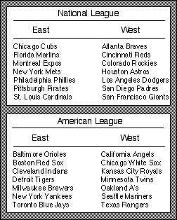
Figure 2.4
Example of presenting categorical information in a table.
The way space is used in a chart or graph to form sequences and patterns is very important. Research has shown that more rapid problem solving results from diagrams in which conceptual relationships are shown spatially, rather than by text (Win, Li, & Schill, 1991). In charts, the sequence of information is usually not a critical feature. For example, there are many ways to sequence the various names and hometowns of major league baseball teams. It doesn't really matter if the American League or National League is listed first or second. The teams are listed alphabetically in Figure 2.4, but changing this order does not change how information in the chart is conveyed.
The pattern of a chart is typically conveyed through row or column headings. The baseball chart is informational because of the primary and secondary groupings: a) American and National; and b) East and West. Also, the proximity of items to one another in a chart may also convey information. A chart that describes an animal family, such as marsupials, would show how much one group is related to another by how close the groups are located on the chart along one dimension.
The sequence of a graph is crucial to understanding the information it contains. For example, the usefulness of a graph that describes average monthly temperatures, such as those shown in Figure 2.5, would be seriously curtailed if it were arranged alphabetically by month instead of chronologically. "Reading" the graph is easier when the graph displays information in a natural sequence. Also, the purpose of a graph is usually to compare information across parts of the graph, such as which times of the year are the hottest or the coldest.
This also speaks to the importance of the pattern of information displayed in a graph. Consider Figure 2.5 containing three separate line graphs: one graph showing the monthly temperatures for both Houston and Pittsburgh, and then one superimposing the two graphs. Graphs such as these are meaningful if they convey trends and comparisons quickly at a glance. When superimposed, the line graphs quickly allow the reader to compare the climates of the two cities.
An effective and popular graph type is the time-series plot, where one axis is tied to some chronological variable, such as seconds, minutes, or years (Tufte, 1983). Scientists often use time-series plots to show how large and complicated data sets change over time. A simple example of the resulting motion of a bicycle's pedal as it turns while the bicycle moves forward at different speeds is shown in Figure 2.6. Of course, computer animation provides many opportunities for improving time-series plots, since the actual dynamics of the display over time could be shown and potentially controlled.
One of the most influential figures on how to visually display quantitative information has been Edward Tufte (1983). His most fundamental principle of statistical graphics is simply "above all else show the data" (Tufte, 1983, p. 92). Yet, it is amazing how often this simple principle is violated, sometimes unintentionally and sometimes deliberately to distort the data (such as for political motives). For this reason, Tufte defines the "lie factor of graphs" as the size of the effect shown in the graph divided by the actual size of the effect in the data. A lie factor of 1 denotes no lie, but ±.05 constitutes a substantial distortion of the data. Tufte (1983) also admonishes designers of graphs to keep "chartjunk," nonessential graphical decoration, to a minimum. Tufte feels that "the best designs are intriguing and curiosity-providing, drawing the viewer into the wonder of the data. . ." (p. 121).
Combining Characteristics of the Three Types of Graphics
It should be noted that graphics are frequently constructed to contain characteristics of two or more of the three graphic types. Representational and arbitrary graphics are often mixed, such as the use of arrows and labels superimposed on a drawing. Pict-o-graphs (or isotypes), another popular type of graph (especially in magazines and newspapers), overlap characteristics of representational and arbitrary graphics, as shown in Figure 2.7.
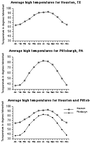
Figure 2.5
Examples of line graphs.
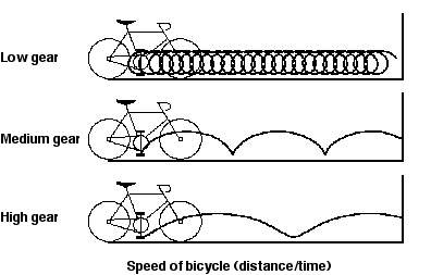
Figure 2.6
Three time-series plots showing the path that a bicycle's pedal follows as the bicycle moves forward, given different gear ratios.
Figure 2.7
Examples of "pict-o-graphs."
The overlay of representational and arbitrary graphics onto geographical maps is one of the oldest mixtures of graphical forms. One of the most striking examples is the map drawn by the French engineer Charles Joseph Minard in 1861 to show the tremendous losses of Napolean's army during his Russian Campaign of 1812. The map, shown in Figure 2.8, is best described by Tufte (1983):
Beginning at the left on the Polish-Russian border near the Niemen River, the thick band shows the size of the army (422,000 men) as it invaded Russia in June 1812. The width of the band indicates the size of the army at each place on the map. In September, the army reached Moscow, which was by then sacked and deserted, with 100,000 men. The path of Napoleon's retreat from Moscow is depicted by the darker, lower band, which is linked to a temperature scale and dates at the bottom of the chart. It was a bitterly cold winter, and many froze on the march out of Russia. As the graphic shows, the crossing of the Berezina River was a disaster, and the army finally struggled back into Poland with only 10,000 men remaining. Also shown are the movements of auxiliary troops, as they sought to protect the rear and the flank of the advancing army. Minard's graphic tells a rich, coherent story with its multivariate data, far more enlightening than just a single number bouncing along over time. Six variables are plotted: the size of the army, its location on a two-dimensional surface, direction of the army's movement, and temperature on various dates during the retreat from Moscow (p. 40).
MATCHING GRAPHICS WITH LEARNING GOALS
An understanding of the three graphic types is prerequisite to an understanding of how they can be used in instruction. As one might guess, there are a myriad of specific ways that each of these graphics can be used in any one instructional situation. The next section begins the discussion of the important issues surrounding instructional applications of graphics, such as should one or more graphics be included in an instructional design and, if so, what role or function should those graphics serve. A necessary first step in the design of effective instructional materials and, subsequently, instructional graphics, is the determination of the lesson goals and objectives.
Instructional Objectives
The most common vehicle for describing learning goals in any one lesson are instructional objectives, also known as performance objectives (Briggs & Wager, 1981). The purpose of instructional objectives is to describe as clearly and precisely as possible what the learner should be able to do at the completion of the lesson. If constructed properly, objectives not only serve as an appropriate guide in the design of instructional strategies and materials, but also indicate appropriate methods of evaluating whether the objectives have been met.
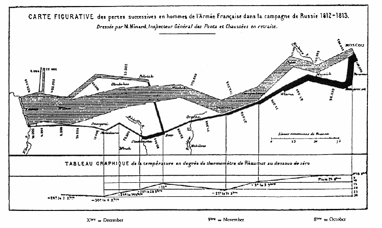
Figure 2.8
Minard's map of Napolean's russian campaign of 1812.
Edward R. Tufte, The visual display of quantitative information (Cheshire, Connecticut: Graphics Press, 1983).
There are many recipes for how to write objectives, but the ABCD model is one of the simplest. This model, as the name implies, has the following four parts: A -- a detailed description of the Audience or learner; B -- a clear and unambiguous description of the Behavior or skill that the learner should be able to do at the end of the instruction (usually containing a carefully chosen action verb); C -- the Conditions under which the behavior will take place, such as tools permitted in performing the behavior or any time restrictions; and D -- the Degree to which the performance must be accomplished, such as complete accuracy (100%).
The effectiveness of instructional graphics largely depends on the nature of the learning task (as described by the behavior) as it interacts with the profile (aptitude and interests) of the learner. The behavior also should reflect the learning domain being emphasized in the lesson. A well-written objective not only helps guide instructional design, but also the type and function of any appropriate graphic.
Domains of Learning
An understanding of general learning theory is essential in designing effective visual displays. Although a thorough overview of learning theory and its applications to instructional graphics design will be presented in chapter 4, an initial understanding of the range of possible learning outcomes will be discussed next because it is a vital first step. Therefore, the purpose of this section is to introduce the range of learning outcomes in the context of the role that graphics may serve in facilitating those outcomes.
There is a wide range of learning outcomes. Probably the most well-known description of learning and knowledge is that provided by Benjamin Bloom (1956). Though somewhat dated, Bloom's original taxonomy of domains of learning is still considered as the standard against which current perspectives are compared. Bloom divided learning and knowledge into three domains: cognitive, affective, and psychomotor. The psychomotor domain involves the learning of physical tasks that require eye-hand-mind coordination. The affective domain largely comprises a person's attitudes and value systems. The cognitive domain concerns the learning of facts and skills and, for better or worse, comprises the "lion's share" of mainstream educational activities.
Robert Gagné (1985) has refined and extended Bloom's original descriptions to include five domains (as shown in Figure 2.9). He divides the cognitive domain into the three separate domains of verbal information, intellectual skills, and cognitive strategies, while keeping the affective and psychomotor domains essentially the same. Just as Bloom's model provides the most detail for the cognitive domain, Gagné's model is most complete for verbal information and intellectual skills. Gagné's model will be used here because of its wide acceptance and application in educational technology. In addition, his model has been widely applied to instructional design (see the section elaborating on Gagné's events of instruction later in this chapter). These events comprise a micro-model of instructional design that describes and prescribes the instructional "milestones" of each lesson. Each of the five domains requires special considerations for the design of graphics. As a field, educational technology has been primarily interested in the cognitive domain, as it encompasses the bulk of instructional questions and problems. For this reason, verbal information and intellectual skills will be the two domains emphasized throughout this book.
Verbal Information Domain
Verbal information involves the learning of factual material and includes verbatim learning, nonverbatim learning, and substance learning. Verbatim learning is learning by rote, such as memorizing a poem word for word. Nonverbatim learning is the memorization of isolated facts, but in a learner's own words. An example is "Columbus discovered America in 1492" (although a Native American might dispute this "fact"). Substance learning involves the summarization of an instructional passage (such as that presented by text, video, or lecture) in a student's own words without requiring interpretation or application.
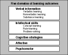
Figure 2.9
The five domains of learning.
An example of how images are used to help a person remember a fact is perhaps best illustrated with a television commercial for margarine popular several years ago. In the commercial, a person spreads the margarine on a piece of toast and takes a bite. Trumpets immediately sound, and a crown appears on the person's head. The intent of the commercial is to associate the image of a crown with the product name (Imperial, in this case). When the viewer goes shopping and has to decide which brand of margarine to buy, the amusing commercial and the image of a crown may be recalled. This, in turn, elicits the product's name. (In contrast, few people remember the exact brand name of another margarine based on the slogan "It's not nice to fool Mother Nature!") (See Footnote 1.)
Using visuals to help remember isolated facts and details is an old, but successful, strategy (Bower, 1970; Carney, Levin, & Morrison, 1988). Visual mnemonics is at the heart of many "memory improvement" systems. In these systems, participants learn ways to quickly contrive and associate some visual image to a fact to be remembered, such as a person's name. The weirder and wilder the image, the stronger the memory trace will be. For example, try this little experiment for remembering the Spanish word for duck -- pato (pronounced pah' toe). Take 30 seconds and visualize a duck with a pot on its head like a hat. Think about how "pot on duck" resembles "pato duck" while visualizing this image. As a test, write "Spanish word for duck" on a slip of paper and place it in your pocket. When you find the paper hours or days later, see if you can remember the word. For most people, this little activity makes them remember the Spanish word for duck forever!
Other examples of visual mnemonics include the many pegword systems (e.g., one is a gun, two is a shoe, etc.) and the method of loci (Just & Carpenter, 1987). The method of loci is a classic strategy often associated with public speakers. The trick is to associate parts of a speech with a mental and visual "tour" of a place you know well, such as your house. You then remember the speech by going on a mental "walk" through your house in your mind. This technique was often the same one used by traveling minstrels or poets hundreds of years ago, many known for their prodigious memories. Although visual mnemonics are proven strategies for recall tasks and other fact learning, there is also some evidence of their utility for higher-level learning as well (Levin & Levin, 1990).
Visual mnemonics serve a transformation function (Levin, Anglin, & Carney, 1987) to directly impact and influence a student's associative memory. Such visuals are believed to be more memorable because of the way they target the most critical information to be remembered. Three components of transformational pictures help to explain this effect (known as the "three Rs" of associative memory techniques): the visuals recode the critical information into a more concrete form, relate it to a well-organized context, which subsequently helps a student to retrieve the information later.
Intellectual Skills Domain
Intellectual skills comprise a hierarchy of skills, each considered to be prerequisite to the other, beginning with concepts, then rules or principles, and, finally, problem-solving.
Concepts. Concept learning entails cognitive classification systems. Concepts are frequently classified as concrete or abstract (Tennyson & Park, 1980). For example, most nouns represent concepts, each falling on the continuum between concrete or abstract. Understanding the concept "chair" means that you can, for example, pick out all the chairs from a group of chairs and tables. To do this, you must understand the distinguishing attributes of chairs and tables -- what makes a chair a chair and a table a table. Sometimes the context or situation can make even strange objects become part of the concept family. For example, a log taken from a stack of firewood can assume "chair" status if the wood cutter wants to take a small break and sit down.
Because there are many varieties and possible examples of any one concrete concept, individuals usually construct their own personal prototype for concrete concepts. For example, what image first comes to your mind when the concept "bird" is suggested? This image is your personal prototype for a bird. Chances are it was something similar to a robin, sparrow, or cardinal. These usually best represent the essence of "bird" for most people. Few people immediately associate an ostrich or penguin, perhaps because the inability to fly or the ability to swim do not match most people's attribute lists for birds. Some words, like cardinal, belong to several concept families, such as birds, religion, and sports (especially for people living in St. Louis). The particular concept family that gets triggered depends on the context (E. Gagné, 1985). Mental prototypes help us to organize world knowledge, although such prototypes can also explain the tendency of people to form stereotypes. Much research suggests that pictures can help in remembering concrete concepts (Paivio, 1986).
Abstract concepts are much harder to represent because they have no tangible form. Examples include the concepts of justice, freedom, honesty, and family. Designers often use a visual strategy where one concrete concept shows a snapshot of the abstract concept, such as a tree to represent the environment. Some abstract concepts hold strong cultural meanings for people. The concept of justice is often represented in American culture with the image of a blind-folded woman holding a set of scales, as shown in Figure 2.10. This image tries to communicate a concrete image of what is meant by justice, although it is certainly just one of thousands of possible representations (another common one is a judge's gavel). Of course, the danger of using such an image is that it may oversimplify the concept or bias the learner away from the breadth or range of examples that the concept actually represents. Analogies can be effective ways to teach abstract concepts (Newby & Stepich, 1987).
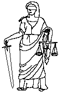
Figure 2.10
In many western cultures, this graphic is prototypical of the abstract concept of "justice" for many people.
How would you illustrate the familiar concept of "education"? Figure 2.11 also uses an analogical graphic for this purpose. This graphic is compelling because it allows many interpretations. The graphic causes one to pause and reflect, rather than providing only one narrow meaning. For example, what do you think the flame represents? To some, it might symbolize knowledge or enlightenment. To others, it might represent the learner. Do you see the hands holding out the flame to others (i.e., sharing), protecting the flame, or nurturing or helping the flame? In all cases, the graphic is an analogy or metaphor for an extremely abstract concept.
Rule Learning and Problem Solving. Rule learning and problem solving are examples of higher-order learning. Rules, also known as principles, comprise the learning of "if/then" situations and relationships. It is easier to precisely define rules in some content areas, such as mathematics and science, than in others. Examples of rule using in math would be the rules of addition and how to reduce fractions to lowest terms. In science, the application of any scientific formula, such as Newton's second law, would be an example of a rule. Of course, rules apply to all content areas, including social situations, such as deciding when to shake hands with someone. Research has shown that some visuals, such as schematics, can be used to help children learn mathematics (Fuson & Willis, 1989; Willis & Fuson, 1988).

Figure 2.11
How would you interpret this analogical graphic of the abstract concept "education"?
Problem solving is very controversial and is not easily defined. Gagné has operationally defined problem solving as the application of two or more rules at the right time and in the right sequence. Problem solving here consists of first isolating or defining the problem and then devising a solution based on rule selection, followed by the decision of when to apply what rule. Problem solving can become very complex very quickly, even using this simple model. There are hundreds of everyday examples. Consider what happens when you are at the grocery store trying to decide what brand of coffee to buy. You have decided to buy one of two brands, depending on which is a better bargain, but unfortunately each brand comes in a different size container. In order to determine the better buy, you have to select and apply the correct rules of how to calculate the unit cost of each brand.
Gagné's definition of problem solving as described above suggests a hierarchical nature of learning in the intellectual skills domain. Problem solving is seen as largely a function of how well all relevant and subordinate rules have been mastered and how well the many rules are associated. Consequently, mastering any one rule requires adequate understanding of the concepts that comprise it. This hierarchy of learning obviously imposes constraints on instructional design. There are competing theories of how people solve problems, such as those viewing the process in a holistic way or those dealing with mental heuristics (e.g., Polya, 1957). Also, many inductive learning theories suggest that it is possible for people to induce rules and concepts when put into problem-solving situations unprepared (Bruner, 1966).
Psychomotor Domain
The psychomotor domain involves the learning of motor skills that require eye-hand coordination, such as typing, riding a bike, and sharpening a pencil. Driving a car is a good example of a psychomotor task as a new driver tries to learn eye/hand, eye/foot coordination to the point of automaticity in order to make the car move and respond according to moment-to-moment demands.
Demonstration coupled with lots of practice remains an effective instructional strategy for the psychomotor domain because most motor skills involve the mastery of physical tasks that are procedural in nature. Media that possess motion, such as films, computer animation, or a real person, are logical choices for the delivery of instructional materials in this domain. For example, the military has long used films to train recruits to do tasks such as how to take apart and put back together weapons, such as rifles and machines guns (Spangenberg, 1973). Computer animation permits the visualization of the many stages of a task over time in concrete ways.
Affective Domain
The affective domain is best thought of as a person's attitudes, beliefs and value systems (Keller, 1983). "Choose" is the key action word for describing behaviors in the affective domain. Attitudes are often reflected in the free-choice patterns of people (Maehr, 1976). Most graphics used in magazine, newspaper, and television commercials deal with the affective domain. Some are very blatant, especially those targeted for certain subgroups, such as those using football or basketball players as role models to promote a product to teenage males. Other graphics present very pleasant, appealing, or highly interesting images (often with implied or expressive sexual connotations), which try to capture a person's attention for a few seconds. Still other visuals may try to associate a certain mood or feeling, such as power or success, with the product. Very few visuals actually provide consumers with accurate product information. (See Footnote 2) Billboards, particularly in highly populated urban areas, are notorious for tailoring their messages to the general profile of people living in the neighborhood, to the point of being stereotypic.
Cognitive Strategies
Cognitive strategies deal with personal mental activities that govern and control other mental operations. Gagné has called these executive control functions. Cognitive strategies originate with each individual. For example, think about what study strategies you use and why you use them. Many students simply read and reread text in order to remember it instead of taking the time and effort to learn more effective and efficient study strategies. Much of the literature dealing with metacognition (thinking about thinking) refers to cognitive strategies (Flavell, 1985). Cognitive strategies probably represent the least understood domain of learning.
Inter-Domain Relationships
The fact that the cognitive domain is stressed in most educational research literature should not suggest that the other domains are unimportant. It is just that researchers thus far have spent more time studying the cognitive domain. In practice, the domains strongly interact (Gagné, Briggs, & Wager, 1992). Crossovers between verbal information and intellectual skills are the most common ones discussed in the literature. People usually will have a need for factual information throughout the learning of intellectual skills. An example would be the experience of following a recipe that unexpectedly calls for grams instead of ounces half-way through the recipe. Factual information, the conversion formula, is needed while performing the procedural task (cooking).
Crossovers between the cognitive and affective domains also have been studied to a degree. For example, we know that a student's attitude for learning can strongly influence the time and intensity invested in a task. The crossover between the affective and cognitive domains is particularly important as it primarily refers to motivation and locus of control. Although research frequently indicates gender differences in learning about science, math, and computers, for example, no real evidence supports a psychological basis for the differences; rather, the differences can be attributed to environmental and cultural influences. Any feeling of inadequacy will certainly make one less likely to want to attempt to participate in a certain subject or task.
There are many crossovers between the cognitive and psychomotor domains. For example, there is no natural reason why anyone would come to a stop at a red light while driving a car. This information is part of the cognitive domain and must be related to the psychomotor skill of bringing the car to a controlled stop smoothly in anticipation of a red light.
The design of instructional graphics is strongly influenced by the interrelationships and interdependency of the five domains. For example, graphics meant to motivate (affective domain) should not interfere with other learning tasks in the cognitive or psychomotor domains. Frequently, designers lose sight of their original goals when deciding on the number and nature of the graphics they wish to include. The distinctions among the five domains must be maintained when designing graphics. Before you can begin to consider how graphics can enhance learning, you must first understand the importance of clearly identifying the desired learning outcomes and then choosing to design a graphic so that it supports these outcomes.
A GUIDE TO THE INSTRUCTIONAL FUNCTIONS OF GRAPHICS
Understanding the most common types of instructional graphics and how they are applied in the various learning domains is an important first step. Of course, simply describing the types of visuals says nothing of their uses and functions in instruction. This section presents an informal guide to help you choose the right type of graphic for the right job. This guide is primarily intended for CBI design, but it applies to other media as well.
The five applications of instructional graphics described in this section are cosmetic, motivation, attention-gaining, presentation, and practice. It is important that you understand the instructional philosophy from which these applications originate. With the exception of the first one, cosmetic, these applications represent major groups of instructional strategies. There are many ways for designers to integrate appropriate graphics in each group.
Characteristics of Successful Instruction
Think back over your many years of experience in education, whether as a teacher or a student, and try to think of one particular time when the instruction really worked. What was it about it that seemed to make learning click?
The search for the essential components of "good" instruction has a very long history, and there are many models and opinions of what actual components are involved. The hope has long been to reduce good instruction to a fundamental group of principles that could be easily replicated. Activities in the social sciences, however, are never that clear-cut. Still, the search for fundamental characteristics of good instruction is a worthwhile endeavor. There are some things on which most professional educators agree. For example, motivation ranks high on the list as an adaptation of an old adage points out: "You can send me to school, but you can't make me think!" It is easy to agree that motivation is important, but difficult to agree on what makes instruction motivating.
Many instructional models are based on behavioral philosophies where learning is viewed as an "input/output" activity -- good instruction goes in and learning comes out. More recent ideas, based on cognitive psychology, recognize the role of what goes in between the input (stimulus) and output (response) as the most important element -- student thought processes (Clark, 1984a; Gagné & Dick, 1983; Gagné & Glaser, 1987; Hannafin & Rieber, 1989a). One longstanding model that has been adapted to fit current theories of learning is called the events of instruction, also provided by Robert Gagné (1985) (Hannafin & Rieber, 1989b). The model has nine events, or "milestones," as shown in Figure 2.12. Instruction needs to consider, though not necessarily incorporate, all of the events.
Most people outside of education usually think of instruction only in terms of the presentation of information, or event 4. It is easy to think of instruction as the "pouring" of information into a learner's head. However, event 4 includes the careful and deliberate selection, organization, and presentation of content. But it is not enough to simply present information to students. Good presentations must be coupled with careful guidance of what is being presented, as suggested by event 5. For example, students should recognize and distinguish among major and minor points and among relevant, incidental, and trivial information. Good instruction assures that this occurs. For this reason, events 4 and 5 are grouped together for our purposes as presentation.
The allure of this model is that it is simple and generic. But, as cautioned in chapter 1, don't let the simplicity of the model mislead you into mechanizing the process it represents. One of the most important premises of this model is that it views purposeful learning as a combination of external and internal conditions. The internal conditions are represented by student thought processes, the external by the instructional environment in which the learner is placed. This premise is based on an information-processing model of learning where thought processes influence how information from the environment is perceived, understood, and potentially stored in memory. Perhaps the largest determinant of all this is what the student already knows (prior knowledge) (Ausubel, 1968).
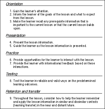
Figure 2.12
The events of instruction.
Notice how these events have been grouped in Figure 2.12. Rather than describing the events separately, it is useful to consider how events in each group interact within the group and then how one group influences other groups. To understand this, try to relate your personal experiences of "good" instruction with the discussion that follows.
While the importance of events 4 and 5 may be rather obvious to most people, students must be properly prepared for these events. It is important to "set the table" properly before "sitting down to eat." This is the general purpose of events 1, 2, and 3. These first three events act as an orientation to prepare the learner for what the following events have to offer. Event 1 makes the deliberate effort to gain and hold the learner's attention. Event 2 sets up learner expectancies, which are extremely important because they help learners to be selective as they learn. Event 2 gives learners a sense of what they should be doing or looking for during the lesson. This helps them to monitor their own learning in order to know when to go over material a second or third time, or to stop and ask questions. Event 2 also helps students to understand lesson procedures to prepare them for intense instructional "sprints" or to settle back and pace themselves for an instructional "marathon." The importance of event 3 is easy to overlook. Event 3 is based on the philosophy that there is very little, if anything, worth learning that is not related, directly or indirectly, to other knowledge. Very little meaningful learning exists in a vacuum. So, if the current lesson relates to something important that was previously learned, instruction must assure that learners actively recall that prior information or knowledge into their working memories, so that they can actively relate the old information to the new. Again, the point is that instruction must not leave this to chance. Therefore, event 3 demands careful consideration. Taken together, these first three events do an important job of preparing the learner for the "meat" of the lesson.
Events 1 through 5 can be viewed as a "one-way street" going from the instruction to the learner. However, learning requires "transactions" between the learner and the instruction (Merrill, Li, & Jones, 1990b). This view sees learning as a process where the lesson information goes on many "round trips" between the instruction and the learner. For this reason, event 6 deliberately requires the learner to become an active agent in the learning process. Attention to event 6 assures that instruction will be very interactive. Giving the learner a chance to respond and interact with the lesson material is only worthwhile if the learner is then given additional information about the degree to which responses were appropriate. This is known as feedback and is identified in event 7. Feedback is an extremely important and potent instructional component and has two qualities that frequently overlap. First, feedback informs a learner to the degree of "rightness" and "wrongness" of a response to reinforce the making of more correct answers in the future. The application of feedback as reinforcement is a pillar of behavioral learning theory. The second quality of feedback, usually considered the more important of the two, is the information that it provides (Kulhavy, 1977). Every time a learner interacts with the lesson, there is a "window" of opportunity for feedback to provide pertinent and relevant information based on the learner's response. This window is probably widest when the learner's confidence in the answer is high, but the answer is wrong. An extreme case would be studying all night, thinking you answered a question well the next day, but then finding out your answer was wrong. You would understandably want to know why. Good informational feedback can be crucial at these times (as well as those occasions that are less dramatic). We will group events 6 and 7 together as practice.
Event 8 simply recognizes that there are times when assessment of learning is necessary. The purpose of testing, as it is defined here, is to judge the quality of the instruction as objectively as possible. Whereas the purpose of practice is to improve learning, event 8 is meant to assess just what learning has occurred. The major goal of event 8, therefore, is instructional accountability, although testing can and should serve other purposes as well, such as increasing motivation and providing more feedback.
Event 9, although shown last in the model, is certainly not least. In fact, event 9 is arguably the most important event of all because it describes the overall purpose of the model and perhaps most instruction as well. Event 9 should constantly be in the designer's mind because it serves as a reminder that the purpose of instruction is not only to remember what we have learned soon after we have learned it, but also later in a variety of contexts. Event 9 encompasses three important learning issues: retrieval, durability, and transfer (Clark & Voogel, 1985; Di Vesta & Rieber, 1987). It is not enough to just remember something when asked; students also should be able to retrieve it long after the lesson has ended and in situations that may not resemble the context in which it was learned. Students should not only be able to answer math questions on a worksheet, for example, but should also be able to use the information on the next shopping trip to the mall. Event 9 must be continually considered because the ability to retrieve information is thought to be largely dependent on the way in which it was initially encoded into memory. Event 9 also completes the discussion started with event 3. Just as the current lesson is related to other lessons that came before, so too will it relate to those that follow. Again, this is accomplished by considering event 9 throughout the design and implementation of the lesson. Event 9 provides much guidance and requires much vigilance.
Lastly, you probably noted that few details were given in the above discussion about particular strategies useful for accomplishing each event. This was intentional. The starting point for deciding how to apply these events is the identification of the learning outcome as defined by the instructional objectives. Selection of the relevant events and strategies for each chosen event depends in large measure on the nature of the learning outcome, the content, and the learners. It must be restated that although all these events must be considered each and every time instruction is designed, not all must necessarily be used. For example, drill and practice software would not need all of the events to accomplish its objectives. Many authors have tried to define particular instructional strategies appropriate to each event (e.g., Gagné, Wager, & Rojas, 1981; Joyce & Weil, 1980), but that is beyond our scope and purpose here. Often, one particular strategy can be useful across many strategies. A good example is questioning (Hamaker, 1986). It can help to gain and focus attention, and it can help to recall prerequisites, guide learning, and, of course, provide practice. It is also probably the most popular test of learning.
Though frequently debated (e.g., Gagné & Merrill, 1988), the identification of particular strategies is also seen by some as part of the "art" of instructional design. Our task in the next section will be to consider how graphics can be a viable part of these groups of instructional events.
Five Instructional Applications of Graphics
The following five instructional applications of graphics are offered as an informal guide to the ways graphics can be used in instruction: cosmetic, motivation, attention-gaining, presentation, and practice. These five applications come as a direct result of the discussions of learning outcomes and the events of instruction. Their purpose is to describe instructional situations in which all three graphic types can be applied. While they are listed here for the purpose of describing the role of graphics in instruction, they will be used throughout the rest of the book for the purposes of design (prescription) and evaluation. Even though these are listed in discrete fashion, their functions frequently overlap, making it possible for the instructional intent and result of any one graphic to be classified across more than one application. These applications are presented as easy-to-remember guideposts for the various uses of graphics in and out of CBI. The rationale for needing these guideposts is that it is very likely that the instructional intent of a graphic can be entirely different from the instructional result when designers make decisions to include graphics based on misinformation, misinterpreted information, or no information.
Three of the applications -- attention-gaining, presentation, and practice -- serve cognitive functions and two of the applications -- cosmetic and motivation -- serve affective functions (as shown in Figure 2.13). These functional categories should help you to design and evaluate instructional graphics based on whether the intent of a graphic is to contribute to learning or to the affective appeal of a lesson. All instructional graphic designers should ask themselves this all-important question each time they begin a project: "What function is my graphic going to serve in this lesson?
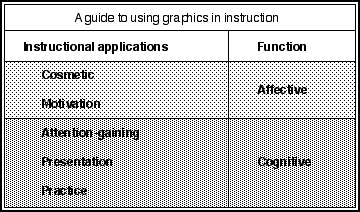
Figure 2.13
Five instructional applications of graphics.
Affective Functions
The purpose of cosmetic graphics and motivational graphics is to enhance the affective appeal of a lesson. Affective applications are designed to improve a student's attitude toward learning or to increase the incentive of a student to participate in the lesson.
Cosmetic Graphics. Graphics are often used for purely cosmetic reasons. In a sense, it is a misnomer to call this an instructional function, because, by definition, no direct learning benefits are expected from cosmetic graphics. The purpose of a cosmetic graphic is to merely add to the polish or decoration of a package to make a program more attractive or aesthetically pleasing (Levin, Anglin, & Carney, 1987). There are too many examples to list them all, but a few common cosmetic graphics are fancy screen borders, some uses of color, and the use of special effects (like animation at the start of a program to display a product's title and publisher). Cosmetic graphics often add a certain level of completeness or sophistication to a package. This may promote the feeling among students that the instruction is important, whether or not this is true.
At their best, cosmetic graphics help maintain student interest and perhaps regain student attention and would heavily overlap the attention-gaining and motivational functions described next. At their worst, cosmetic graphics distract student attention from other important material. An example of a cosmetic graphic is shown in Figure 2.14. Here the graphic is included in a lesson on the history of sports. Notice that the graphic has nothing to do directly with the lesson text, but merely adds visual appeal to the frame. Unfortunately, students may get the impression that the graphic is directly relevant to the text and thereby might spend time looking for learning clues in the graphic. When this happens, the graphic poses the risk of distracting the student from the intended lesson goals. Distraction is the Nemesis of instructional graphic design (e.g., Willows, 1978).
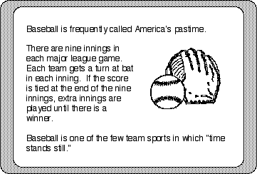
Figure 2.14
Snapshot of a CBI lesson using a cosmetic graphic.
Distraction effects pose threats to learning because of the severe processing limitations of short-term memory (this will be discussed in more detail in chapter 4). Therefore, anything that offers the potential of distracting students' attention from the lesson goals must be carefully evaluated. The haphazard use of cosmetic graphics is an example of where good intent can lead to unfortunate outcomes. Steps must be taken to assure that learners will not be misled into perceiving some underlying instructional value of a cosmetic graphic. The frequency and position of cosmetic graphics should be strictly controlled.
Motivational Graphics. Graphics are often incorporated into instruction to raise the general motivational level of a lesson. Much of the motivating appeal of graphics is due to novelty. Unfortunately, novelty effects are temporary, gradually disappearing over time (Clark, 1983). A good example of failing to recognize novelty effects is the early history of microcomputers in the classroom. Many believed that students naturally learned more from microcomputers because they wanted to work on them and because it was so easy to keep them on task. However, comparative reviews of media research favoring the computer over traditional instructional media were often found to be based on novelty effects (Clark, 1985). There is nothing wrong with taking advantage of novelty effects so long as one understands that the opportunity to enhance learning solely because of novelty is short-lived. As students become more familiar with computers, the prospect of interacting with one becomes less and less exciting, and hence the novelty effect disappears. The inherent instructional design of the materials delivered by computer is all that's left to influence the learner. But that is the way it should have been from the beginning.
Using graphics to arouse general curiosity and interest is seen by many as a very superficial way to increase motivation. There are deeper ways to maintain attention and interest beyond the simple provision of interesting graphics. For example, if the nature of the learning task is satisfying, relevant, and challenging, students are more likely to participate in meaningful ways (Keller & Suzuki, 1988; Kinzie, 1990; Lepper, 1985; Malone, 1981). Hence, their time on-task is not only increased, but the quality of this learning time is enhanced as well.
Professional educators frequently argue about whether instruction should contain entertainment-like qualities. We all probably agree with the two ends of this debate. Learning certainly demands effort and hard work, but instruction does not need to be boring and dull. Instruction is certainly a serious business, but it need not be grim. At what point, we must ask ourselves, do we feel that instruction is responsible to entertain students? Graphics can be used as one strategy to maintain motivational appeal by constantly refreshing the lesson's level of novelty and curiosity. However, the power of computer graphics as a long-term motivational tool designed to increase student perseverance does not have much empirical support (e.g., Surber & Leeder, 1988).
Cognitive Functions
Graphics that serve cognitive functions are designed to directly enhance the ability of students to learn from instructional materials. These graphics should be designed to achieve, or help achieve, one or more of the events of instruction.
Attention-Gaining Graphics. Of the three orienting events of instruction, graphics are used more often, by far, for attention-gaining -- and for good reason. There are many sources of stimuli that compete for a person's attention in and out of the classroom. Many, if not most of these sources are probably far more interesting than the instruction itself. Usually, these competing stimuli come from the student's environment, such as a buzzing light, sniffling nose, screeching chairs, music or laughter from down the hallway, a growling stomach, or an attractive member of the opposite sex sitting in the next row. Competing stimuli also can come from within the student's own mind, such as personal concerns like a home crisis or just general daydreaming.
For these reasons and many more, attention-gaining is an important initial event of instruction (Gagné, 1985). Attention-gaining applications are obvious, practical, and rational uses of graphics. For example, animation can be an effective way of arousing and maintaining a learner's attention during CBI, as depicted in Figure 2.15. In this example, an animated space shuttle flies across the computer screen. The purpose of the animation in this example is not to teach something, but only to attract and focus the student's attention onto the computer screen. Hopefully, this attention will be maintained long enough to capture the student's interest in the learning material on the screen. As with cosmetic applications, graphics that purposely serve to gain attention should not subsequently distract attention from other important and salient lesson features.
Other examples include interesting special effects for transitions between instructional frames or lesson parts. Special screen washes, moving symbols or characters (cartoon or text), animated prompts, such as arrows that direct attention to key words, paragraphs, graphics, or other screen items are still other examples of animated attention-gaining devices. In addition, animated figures offer contrast to a static background, thus bringing the animated figure to prominence and allowing important lesson information to be amplified or emphasized (Hannafin & Peck, 1988). Interesting graphics contained throughout a CBI lesson can help maintain a student's attention. One reason that graphics seem to work is that they offer a degree of novelty. Attention is naturally drawn to what is new and different. Remember, however, the temporary nature of novelty effects.
Among the qualities of static graphics that increase the level of student interest is moderate to heavy richness of detail (Dwyer, 1978; Fleming, 1987). Some people may notice a contradiction with this and the principle, discussed in the last section, indicating that learning often results from representational graphics containing relatively low levels of realism. But there is a big difference between using a graphic to capture the attention of someone versus using that graphic to teach something. This is just one of many examples of the "form follows function" principle, where the type and design of a graphic must be determined by the function that the graphic is supposed to serve.
Presentation Graphics. Graphics are frequently used to teach. This application represents the main body of reported research discussed in chapters 5 and 6 (Alesandrini, 1984; Alesandrini, 1987). Graphics can be used with or without accompanying text to demonstrate or elaborate a lesson concept, rule, or procedure. The processing partnership between visual (e.g., static or animated graphics) and verbal (textual) information is the foundation of several theories of long-term memory (Bower, 1972; Paivio, 1979, 1983, 1986) and is discussed in more detail in chapter 4. The use of static and animated graphics as a presentation device has been called a "learning-by-viewing approach" to instructional graphics (Reed, 1985). Most instructional applications of this type use representational graphics to directly visually depict critical information and are probably the most common way pictures are used to help students learn from text (Levin, Anglin, & Carney, 1987).
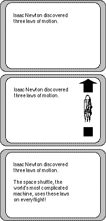
Figure 2.15
Snapshot of a CBI lesson using animation as an attention-gaining device.
Another example of a presentation graphic is illustrated in Figure 2.2 in a lesson describing the functions of an astronaut's space suit. Again, the graphic and the text share a special relationship. The graphic provides a visual elaboration of the information contained in the text. However, this graphic could be greatly improved with the use of labels to highlight each component of the suit. A CBI lesson could easily be designed to precisely indicate each part of the suit, either on separate frames or interactively on one frame.
An example of using animated graphics as a presentation tool is shown in Figure 2.16. Here, animated graphics demonstrate an application of the laws of motion. Animated presentations can also aid a student's conceptual understanding of interrelated lesson variables. In this way, presentation graphics help students to interpret difficult-to-understand information. The use of visual analogies, such as a graphic of a mechanical pump to help describe the difference between systolic and diastolic blood pressure (Levin, Anglin, & Carney, 1987), is a common strategy. Another good example of how graphics can help a student's conceptual understanding is the program shown in Figure 2.17. The goal is for students to try to create or replicate a given "product" (Kosel & Fish, 1983). The product starts out in raw material form as a square wafer. The raw material is sent through any number of combinations of punch, stripe, and rotation "machines" chosen by the student. These machines successively alter the product into its final shape. Animation helps students understand how the changes to the product occur in intermediate phases and how the order of the changes affects the final outcome. Children, or other novices, would be expected to benefit from these kinds of animated displays, since they probably would have difficulty in visualizing abstract relationships on their own.
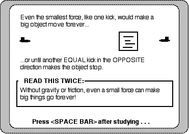
Figure 2.16
Snapshot of a CBI lesson using an animated presentation graphic. The block moves slowly across the screen after being kicked.
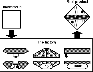
Figure 2.17
Using computer animation, the raw material get transformed into the final product by successively going through the three machines in the "factory".
Representational graphics are an effective presentation strategy when combined with text. The graphics help learners focus their attention on the explanative information in the text (Mayer, 1989). Graphics also help learners form visual mental models of the materials explained by the text. Mayer and Gallini (1990) suggest that visuals are useful presentation strategies when they satisfy four conditions: 1) the text is potentially understandable by students; 2) the visuals are designed and evaluated in terms of learner understanding; 3) the visuals are used to explain information provided by text; and 4) students have little or no previous experience with the content.
Finally, presentation graphics can also serve an organizational function (Levin, Anglin, & Carney, 1987) to help make relationships between ideas more apparent. The most common examples of these are "how-to-do-it" graphics that show a set of step-by-step procedures in visual form. Examples include how to assemble a household device or how to perform an emergency medical procedure, such as cardiopulmonary resuscitation (CPR). Such procedural applications of graphics are very relevant for many psychomotor tasks, as shown in Figure 2.18.
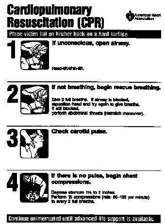
Figure 2.18
An example of a procedural graphic that illustrates a step-by-step sequence of tasks.
Reproduced with permission. "Cardiopulmonary Resuscitation CPR Wall Chart," 1986 ©1986 American Heart Association.
Graphics in Practice Activities. Graphics can be very useful in practice activities. Graphics can act as visual feedback to students as they interact with lesson ideas and concepts. This application of graphics is particularly suited to the computer medium, such as those involving visually based simulations. Real-time animated graphics in interactive learning displays are also known as "interactive dynamics" (Brown, 1983). Real-time animated graphics change continuously over time, depending on student input. Students learn in these highly interactive visual environments by discovery and informal hypothesis-testing. Graphics act as instantaneous feedback. Brown (1983) called this application of animation "learning by doing." Examples include graphic, real-time simulations, such as piloting an airplane as shown in Figure 2.19, interacting with a Newtonian particle in a gravity-free/frictionless environment (diSessa, 1982; Rieber, 1990b; White, 1984), and graphic programs where students learn musical concepts (Lamb, 1982). Other examples include graphic programming procedures in LOGO, where students drive an animated "turtle" (Papert, 1980). However, students must be able to perceive differences in the graphic feedback, an ability that novices especially have a difficult time attaining (Brown, 1983; Cohen, 1988; White, 1984). Interactive dynamics should be structured to offset this deficiency (White, 1984; Rieber, 1989) or to augment such interactions with coaching or other prompts (Reed, 1985). Learning from interactive dynamics appears very contextually bound. This use of animation is not easily replicated with media other than the computer.
Graphics are commonly used in more traditional practice activities in CBI, such as question and answer. Often, the role of graphics is merely to reinforce correct responses, such as displaying a happy face for right answers. The danger is that attractive and interesting graphics may actually reinforce wrong responses or other behaviors. Some computer chess games, for example, visually personify the chess pieces. When one piece "takes" another, some programs actually show the "execution" of the captured piece. A person who finds such visuals motivating might want to lose the game just to witness the graphical results.
A simple guessing game illustrates the value of different types of graphic feedback. Most people, at some time in their lives, have played a guessing game where player 1 thinks of a number from 1 to 100 and player 2 tries to guess what it is. The only clues given to player 2 are whether the guesses are too high or too low. By considering each clue, player 2 should be able to quickly narrow down the range in which the mystery number falls, and then finally pinpoint the exact number. The players reverse roles, and the one who took the fewest number of guesses is the winner of the round.
It is easy to construct this mystery number game on the computer, where the computer assumes the role of player 1. The computer chooses a number at random and tallies the number of guesses until the mystery number is discovered. For each incorrect guess, the computer displays the clue "too high" or "too low." A slight modification to the game can be made to involve visuals. The simplest modification would be displaying the prompt to be spatially congruent to the clue, such as displaying "too high" at the top of the screen and "too low" at the bottom of the screen. However, a more intriguing modification would be to display the clues relative to the mystery number along a vertical or horizontal axis. In this way, the student would not only see in which direction the guess is wrong, but by how much.

Figure 2.19
Snapshot of a computer flight simulator as the user tries to land the airplane. The graphics change continuously in real-time depending on the user input of the various controls.
In another variety of the game, the clues change from "too high" or "too low" to "hot" or "cold," as shown in Figure 2.20. Very inaccurate guesses are "freezing," but get "hotter and hotter" as the student's accuracy improves. The purpose of the graphics in each of these examples is to provide visual feedback to students based on their guesses. Secondarily, the graphics help make the game more entertaining as well. The graphic feedback in Figure 2.20 can be easily improved further by adding some cultural conventions. The graphic could be rotated to match the convention that thermometers are usually oriented vertically with hot always toward the top. This is an obvious place for color as well because red is a standard in western cultures for hot and blue for cold.
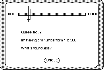
Figure 2.20
An example of poviding visual feedback.
REVIEW