
Table of Contents
This chapter synthesizes information contained in preceding chapters and applies it to the instructional design of computer-based instruction. One premise is that graphics can only be designed in the context of the entire instructional system. Therefore, this chapter carefully examines the relationship between instructional design and development from both traditional and alternative views. In particular, this chapter compares and contrasts formative evaluation with rapid prototyping techniques, which appears to be aptly suited to computer-based instruction. This chapter also introduces the concepts of screen design, frame protocol, and procedural protocol, and discusses the related areas of human factors and the roles of color and realism in visual displays. The chapter concludes with instructional graphic design recommendations for four of the five instructional applications introduced in chapter 2 -- cosmetic, motivational, attention-gaining, and presentation. The fifth application, practice, is the topic of the next chapter.
After reading this chapter, you should be able to:
After reading this chapter, you should be able to:
Up to this point, this book has laid the groundwork for the role of graphics in instructional design. Previous chapters have explored and considered knowledge bases most relevant to the design of instructional graphics -- learning theory, instructional theory, instructional design, and research of instructional visuals (static and animated). Issues surrounding computer graphics production also have been considered. This book has stressed the importance of designing visual materials in relation to an entire instructional system. That is, instructional design must try to take into account all of the instructional variables inherent in a learning environment, rather than considering one or more in isolation. Our intention has not been so much to consider the design of visuals for instruction, but to approach visualization techniques as important tools for designing all instructional strategies.
The purpose of the next two chapters is to consider the design of instructional materials, given the powerful arsenal of computer visualization techniques. These are not meant to be chapters on graphic design, although such knowledge or skills would obviously complement the ideas contained here. Specific design recommendations are presented in the next two chapters to help apply graphics in instructional design.
COMPUTER GRAPHICS AND INSTRUCTIONAL DESIGN
Instructional design is complex and involves a dynamic blend of subjective and objective processes. Instructional designers must appropriately identify and maintain an effective balance of hundreds of variables ("juggle" is a good metaphor). They do not simply and objectively apply a series of stoic principles culminating in effective instruction, nor do they merely use intuition and guesswork. The best instructional designers blend analytical, empirical, and artistic approaches in ways even they probably do not sufficiently understand.
Instructional designers need to recognize their personal philosophies of learning and instruction, because these philosophies ultimately account for the instructional products they produce. Consider, for example, how one's philosophy of how people learn impacts one's view of instructional design. For example, compare the differences between behavioral and cognitive philosophies (discussed in chapter 4). Since each orientation makes radically different assumptions about how people learn, instructional designs based on each philosophy will necessarily be different. One's philosophy of learning "bubbles up" to influence the resulting instructional design, as shown in Figure 7.1.
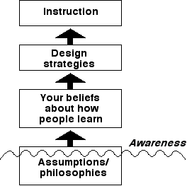
Figure 7.1
An illustration of the cause/effect relationship between the assumptions and belief systems of the instructional designers and the instruction that results. A designer's fundamental assumptions and philosophies, even those below the awareness level, affect beliefs about how people learn. These affect instructional design and, in turn, the final instructional products which follow.
In the next section, we will briefly revisit traditional views on instructional design and compare these to possible alternatives. Whether you see more differences than similarities will largely depend on your personal philosophy and understanding of instructional design. The importance and relationship of these issues to graphics is simply that the role and design of instructional graphics are necessarily linked to the overall design philosophy under which a design is operating -- the designer must be fully aware of this philosophy, as well as other related assumptions, and, potentially, biases.
Chapter 2 presented an overview of the fundamental principles associated with traditional instructional systems development (ISD). The focus here is on a few key elements of lesson design. This section concentrates on the results of traditional ISD in the "real world," even though its intent and purpose may be more flexible in theory. As a reminder, these principles will be discussed in the preparation of instructional materials, as opposed to the process a teacher goes through in preparing a lesson for delivery in a regular classroom. Although aspects of the processes are similar for both, materials-centered instruction goes further and considers the selection and development of instructional media. This last condition (or assumption) is an important distinction, which also makes the role of graphics particularly relevant.
Traditional views of instructional design at the lesson level begin with identifying lesson objectives. Although the intent of traditional ISD is to continually remain open to revision, there is a tendency to avoid questioning the appropriateness of the lesson objectives after they have been identified.
The next step is to begin the design phase. A lesson plan or "prescription" is drafted and revised until a lesson script is written. The script becomes the starting point for the development phase. After the first drafts of the instructional materials are produced, the process of formative evaluation begins. The purpose of formative evaluation is to improve the materials through a structured series of field tests. In contrast, the purpose of summative evaluation is to provide information on the final effectiveness of the materials without intending to use the information for revision (Gagné, Briggs, & Wager, 1992).
Usually, the field tests begin with one-on-one trials with individuals most representative of the target population. The designer/developer observes these individuals' early reactions to the materials. Only the major weaknesses of the design can be identified at this stage. The formative evaluation process usually proceeds to small group tryouts and then to environments with conditions and constraints that designers believe closely resemble those of the final installation. All along the way, feedback from each field test is used to successively revise the design from which new materials are produced.
Obviously, the costs of producing instructional materials varies widely depending on the medium chosen. The development of video materials, especially those involving studio productions, can be very expensive due to the costs and demands of equipment and technical personnel. Before setting one foot in the studio, it is usually necessary to have all aspects of the production finely detailed and orchestrated, down to every word in the script and every aspect of every camera angle. There is little tolerance for creative "fudging" with the production at this stage. Given studio production costs, it is important to get it right the first time. But how can one be sure that the instructional design is appropriate and will work? It would be impractical to assume that the production can simply be repeated until the instruction is appropriate.
One common strategy is for instructional designers to use prototypes of the materials early in the formative evaluation process. That is, even though video may have been selected as the most appropriate instructional medium, nonvideo materials can be developed first to test various aspects of the instructional design. For example, early versions of the materials may be tried out in print-based form, such as with the use of printed texts and graphics, so that by the time the first studio session is conducted there is confidence in the design.
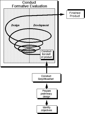
Figure 7.2
An illustration of the cyclic nature of formative evaluation as it is usually practiced within traditional ISD. The flow lines represent feedback loops from one stage of the process to the next. Once formative evaluation begins, design and development provide a continual spiral of feedback as early drafts of materials are field-tested and revised resulting in a finished product.
A characteristic of formative evaluation in traditional ISD is that design and development remain separate processes, though each is expected to provide critical feedback to the other. This revision cycle spirals from the earliest rough drafts to the final instructional product in media form, as illustrated in Figure 7.2. Traditional ISD frequently assumes and expects that designers and developers will not necessarily be the same people. A strength of ISD is that it allows for effective management and communication of many people working together with limited resources. Still, the process of formative evaluation in traditional ISD is prone to the weakness that some designs may be committed to prematurely once development work has begun, even though traditional ISD speaks to an openness and willingness to revise a design throughout the process. It might be argued that such weaknesses, though unfortunate, may be a necessary part of the process, given certain media (such as broadcast-quality video).
It is reasonable that certain media, such as video, simply demand a more rigid delineation between the design and development phases. But is this true for all media? What about print-based or computer materials? Word processing and desktop publishing have transformed the process of producing high-quality printed materials from raw copy. Even video offers many examples of inexpensive and portable equipment, such as camcorders and small-format editors, which offer greater availability and flexibility than studio equipment. For the rest of this chapter, we will focus on how the computer affords a much different design and development cycle than that suggested by traditional ISD. The next section describes what some perceive as an alternative approach to the formative evaluation procedures commonly discussed by traditional ISD advocates.
Rapid prototyping describes a design philosophy based on the idea that design, development, and implementation can never truly be separated and distinguished from one another. To some, rapid prototyping may represent mere extensions of formative evaluation of traditional ISD; for others, it represents a dramatic shift -- a true design alternative. Again, your interpretation will largely depend on your current view of instructional design. (See Footnote 1) Tripp and Bichelmeyer (1990) present a compelling argument that rapid prototyping represents a philosophical shift in instructional design.
Any one instructional design is but a reflection of the designer's interpretation of the problem at a given time. Therefore, instructional design can be characterized in as many ways as there are instructional designers. To suggest that there exists any one model of instruction may be totally misleading. Design only begins to assume some meaning or value when it is implemented. For this reason, it makes little sense to try to pretend that it is possible to accurately prescribe and predict anything in advance. By definition, instructional design is relevant and important only in terms of its proven effectiveness with the intended learners in the intended setting. Given the complexity of the design process, designers are necessarily making decisions with either incomplete information or no information. Therefore, much design is necessarily based on conjecture.
On the other hand, it would be a mistake to believe that designers who practice rapid prototyping are actually "winging it." Rapid prototyping assumes the need for any of a number of required knowledge bases -- including an understanding of learning theory, instructional theory, and instructional practice -- as well as profiles of the intended learners, an understanding of the content area, and consideration of any number of contextual constraints (such as the physical learning environment, motivational factors, availability and limitations of resources, and so on). A thorough understanding of traditional ISD (including its strengths and weaknesses) would also be an important knowledge base. Design associated with rapid prototyping does not begin with blind guessing, but with intelligent and informed first-generation prototypes, which may or may not develop into a final product.
There are a number of critical principles and assumptions associated with rapid prototyping that potentially serve to distinguish it from formative evaluation in traditional ISD. The first is the relationship between design and development. Rapid prototyping assumes that key aspects of design, including even a more complete understanding of the problem (and therefore, the identification of the lesson objectives), can only be determined as a consequence of constructing and testing prototypes. In this way, design and development become interdependent and intertwined and, in a sense, are really one process, though perhaps separated into individual activities and tasks to simplify managing the process. In reality, the degree to which design and development are either implemented as one or two processes is more of a continuum than a dichotomy, such as that represented in Figure 7.3. There seems to be a point somewhere on this continuum where one crosses the threshold between a traditional application of formative evaluation and rapid prototyping.
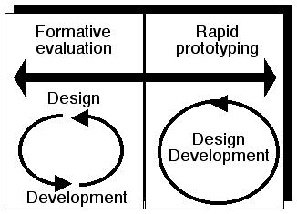
Figure 7.3
The relationship between instructional design and instructional development is continuous, not dichotomous. There seems to be a point where design and development act as one process. This "threshold" represents a distinguishing characteristic between formative evaluation and rapid prototyping.
If design and development act as one process, the final definition of the lesson objectives can only be accomplished as a result of the prototyping phase. This is in contrast to traditional ISD, where the objectives are usually fixed as design and development are initiated. (In theory, it is meant to remain flexible and open, but this is usually not the case in actual application.) An example of a rapid prototyping model, adapted from Tripp and Bichelmeyer (1990), is shown in Figure 7.4. In addition, rapid prototyping offers the flexibility to test radically different designs and approaches, including rival hypotheses. Classic examples are those based on structured learning approaches, compared to letting individuals discover principles on their own.
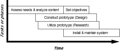
Figure 7.4
A rapid prototyping model applied to instructional design adapted from Tripp & Bichelmeyer (1990). A critical aspect of this model is that final identification of the lesson objective/s occurs while constructing and utilizing the prototype.
Another critical assumption of rapid prototyping concerns the medium within which the designer is working. Not all media lend themselves to rapid prototyping techniques. Tripp and Bichelmeyer (1990) note that "rapid prototyping presupposes a design environment that makes it practical to synthesize and modify instructional artifacts quickly" (p. 38). Media must possess at least two important attributes -- modularity and plasticity -- in order for rapid prototyping to be practical (Tripp & Bichelmeyer, 1990). Computer tools are usually able to easily satisfy both attributes.
Modularity refers to the ability to add, delete, or rearrange entire sections of the instruction quickly and easily. The way many people prepare presentations or lectures based on the use of overhead transparencies is a good example of modularity. Plasticity refers to the ability to make modifications to the existing prototype materials with only minor time and effort costs. Obviously, different media vary widely in regard to plasticity. Again, take video, for example. Imagine shooting a scene set in the context of the old west as the pioneers are traveling on the Oregon Trail. What would the designers need to do if they discover the next day that many of the shots inadvertently show a distant highway with an occasional car or truck? There would be no alternative but to reshoot all of the affected scenes. Most currently available computer tools offer optimal environments for rapid prototyping based on the constraints and assumptions of both modularity and plasticity, especially those based on graphical user interfaces (GUIs) as discussed in chapter 3. Box 7.1 presents an overview of rapid prototyping principles in a unique way -- by comparing instructional design to building a paper plane.
|
|
|
Here's a simple example which may help you to understand the important principles and assumptions of rapid prototyping (RP). As Tripp & Bichelmeyer (1990) point out, RP has been a common tool for designers and engineers in many other fields, such as the aerospace industry. Fittingly, this example uses an everyday understanding of a complicated system -- aeronautics -- in the context of a universal experience (I hope) -- building a paper airplane. The intent is to use this example as an analogy to instructional systems. If possible, find someone to do this project with you (I suggest a child). As you do it, get in the habit of expressing whatever thoughts are on your mind at the time. Take a 8 1/2" X 11" sheet of paper and, without doing any research, make a paper airplane. Go ahead and try it out. How well does it fly? Not so good? What should you do, start over? Resist this temptation at first, and, instead, try to make some modifications to your plane that you think will help it fly better. For example, based on your personal theory of flight, fold the back edges of the wings either up or down slightly. Try flying your plane again. How much a difference does this little modification make? Continue to make additional minor modifications. Go with your feelings and intuitions. Make modification after modification and test lots of hypotheses regarding what you think should improve the plane's design. Maybe get paper clips and pennies to see if adding weight helps or hurts. You'll probably discover many important principles of flight as well as the boundaries and limits to these principles. Spend at least 10 minutes in this experimental phase, still only using the first plane you constructed. Now, stop for a moment to pause and reflect on what you just experienced and what you think you now know about the design of a paper airplane. Reflect on the meaning and importance of the design and development cycle and how important your test flights are to understanding if your design hypotheses are worth pursuing further. How many throws does it take to test one design hypothesis -- one, two, five, ten? Consider the simple and straightforward feedback that each toss give you. How many total flights have you made? You probably lost count. Take another sheet of paper and do it again. See if this next attempt begins with a better or more refined design. Are there things you will immediately do differently as you begin to test this plane? Unfortunately, you have probably been testing your plane very subjectively up to this point. That is, you know a good flight when you see it, but you probably have not, as yet, expressed in some objective way what you feel are the characteristics of a good flight. Therefore, let's give some serious thought to the testing of this plane. What criteria should you use to judge the effectiveness of the plane's design? Most people usually use distance as an important measure, perhaps followed by accuracy. Try to make your testing as objective as possible. Set up a testing environment which builds in your criteria and start collecting data. Let's focus on distance and accuracy. Clear a flight path in the room where you are working (or better yet, find an unobstructed hallway). Choose a starting line. Throw your plane and keep track of the number of times your plane lands within a certain path (to test for accuracy) and also how far your plane travels (to test for distance). Keep a careful record and study your data. Calculate some statistics. What is the average distance? What is the percent of accurate flights? Get some other people involved and have contests. See who can design the best plane. After you've arrived at the winning design for a paper plane, do something that is both unnerving and disconcerting: take another sheet of paper, crumble it up into a ball, and see how well this design fares under the testing environment you've devised. My guess is that this "plane" does as well or better for both distance and, especially, accuracy than the planes you've designed up to this point. Why? There are several reasons. Distance and accuracy, though important, do not capture other important elements of aerodynamics related to concepts such as gliding ability or lift. You also probably did not control for the amount of force allowed for each throw. Add these to your criteria and see what happens. Some designs seem better able to "ride on" or glide in the air. How similar are the designs of all the people involved? Unless there is an individual in the group who either is very creative or has an interest in paper planes and knows other designs due to past experiences, chances are the planes are almost identical in terms of their fundamental design. The first design most people come up with usually resembles something like this: 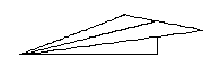 See the last page of the chapter for examples of other radical designs. Build them, test them, and compare their results to those you've created. What is this little activity supposed to teach us about rapid prototyping of instructional materials? First, notice that design and development were intertwined and interdependent. Did you plan out your design by, say, drawing it out on a separate sheet of paper? Of course not. Not only is it a rather silly thing to do, it's also very difficult. Try it sometime. How do you represent the procedural nature of the design? How do you represent hidden folds or the strategic tearing of paper. In fact, it is much simpler to show your design in the completed model. Similarly, it is important to consider the "gulf" between design and development of instructional materials. Even in traditional instructional approaches, design and development are expected to provide important feedback loops to the other. You are expected to learn about design through the testing of early prototypes. In other words, instruction is meant to be improved over a succession of design and development cycles. This is the role of formative evaluation at the lesson level. Unfortunately, all too often there is too great a gulf between design and development so that by the time the first draft materials are developed, there is already too great an investment in the original design. There is a high risk early on to growing complacent and accepting and committing to inferior designs. RP assumes that you will learn much, if not most, about your design only through rapid turn-over of design, development and evaluation. Second, consider the medium in which you have been working -- paper. As Tripp & Bichelmeyer (1990) note, RP assumes that the medium satisfies the attributes of modularity and plasticity. Paper allows you to fold, bend, and shape the plane in a variety of ways. It allows you to change small, but important features of the plane's form quickly and easily (remember the bending of the back of the wings). Adding and subtracting elements, such as weight via paper clips and pennies, can be tried after the basic design is finalized. How well would other media work? Try using light and then heavy cardboard. Now try using modeling clay. You might as well throw a rock. The lesson here is that the medium must still be appropriate for the task. Paper, unlike clay, has some inherent characteristics which are appropriate for flight: light, strong, holds shape, long and flat while still rigid enough to catch and ride the air. Similarly, one cannot choose an instructional medium arbitrarily. The medium must still be appropriate for the activity. The virtues of RP, therefore, cannot be realized in every instructional medium, at least not at the same implementation level. As you built the plane you probably felt the urge to try it out as soon as possible. Although you were probably careful as you made your folds, you probably did not want to spend more than a few minutes designing and constructing your plane. That's easy to understand, because the fun is in flying the plane, not building it. You also know from the start that the value and interest in the project is in the act of flying, not in the act of folding. Although one could make a case about the aesthetic appeal of the plane (as in the case of building a store-bought plastic model kit), most people rarely use aesthetics as a way to judge their paper plane. Similarly, the value and interest in an instructional design is in its implementation. You learn about the value of the design only by developing it and trying it out. Did you expect your plane to fly perfectly the first time you threw it? Perhaps you had high expectations at first, but you probably discovered soon that the plane would never fly as well as you first thought. Similarly, the only way to get a realistic analysis of the completeness, appropriateness, and limits of the goals of an instructional design, and subsequently, its effectiveness, is in the actual context of its use. Consider how you arrived at your first design. The traditional model for a paper airplane is usually the only one with which most people experiment. Thereafter, it is usually very difficult to come up with truly alternative, creative designs. The same probably holds true for many instructional designers. They tend to think of instruction in only a limited number of ways. The traditional paper plane design might be analogous to a traditional application of Gagné's events of instruction. Once you have formulated your own sense of what instructional design is or should be (such as "first present information to students, and then you have them practice it"), it can be difficult to consider alternatives. Although one may make many minor adjustments (such as trying different questioning strategies), the basic fundamental design remains the same. RP allows (encourages) you to design, develop, and compare seemingly opposite designs. The ways in which you tested the paper plane also offer very important lessons for instructional design. Feedback from testing is only valid if you are gathering appropriate kinds of information and interpreting it in appropriate ways. Distance and accuracy seem like obvious data to collect -- until you compare the performance of a paper ball (especially one filled with paper clips). When testing instructional designs, one needs to be sure that the tests properly reflect the objectives. RP goes further to help designers to fine tune their initial objectives and to determine others. Too often, we only interested in performance data, like scores on a posttest, and fail to consider other sources of information, such as a student's motivation to participate and persist in an activity. It might be argued that almost any design will produce results if we somehow require (or force) students to comply, such as with external incentives such as grades, much like the paper ball being thrown as hard as possible simply to satisfy the goals of distance and accuracy. Perhaps the lesson for instructional designers is to be on a constant vigil for information which may provide useful insights to improve the instruction. In addition, it is important to remain open to consider information from a wide variety of sources. The best designs for a paper plane take advantage of the plane gliding through air with only the slightest momentum. So too, the best instructional designs usually work by intrinsically motivating the student to go as far as they can with but the slightest prompting or coaxing. |
Traditional ISD versus Rapid Prototyping in the Design of Instructional Computer Graphics
The purpose of comparing formative evaluation to rapid prototyping is simply that one cannot separate decisions regarding the design of computer graphics from the instructional and learning contexts within which they will be used. All the questions related to the appropriateness of graphics, the type of graphics, and the nature of the graphical elements must be considered and answered within the context of the overall instructional design. The more aware designers are about their instructional design philosophy, the better equipped they will be to make appropriate decisions. There are some obvious advantages and opportunities when computer tools are mixed with rapid prototyping techniques. CBI designers are encouraged to use rapid prototyping to test instructional designs that use a variety of graphical techniques. In addition, the principles of rapid prototyping should be used as the basis for understanding the remaining ideas presented in this chapter. Rankin (1989) has proposed an illustration design model founded on a mixture of principles related to formative evaluation and rapid prototyping procedures.
SOME GENERAL GRAPHIC PRINCIPLES OF SOFTWARE DESIGN FOR COMPUTER-BASED INSTRUCTION
The next time you take an automobile trip on a major highway, try to imagine the amount of planning that went into all aspects of the roadway's design. Give special attention to road signs. Reflect on their purpose and importance. Considering all of the other demands on a driver, signs serve an extremely important function. When designed well, they provide critical information to the driver in plenty of time to make decisions, but not so far in advance that the information is not yet relevant. When designed well, they are taken for granted, allowing the driver to devote attention to more important matters, such as traffic patterns. When designed poorly, drivers get lost, miss exits, waste time, and get very frustrated. Worse yet, they may have accidents.
Interacting with computer software, instructional or otherwise, is similar to taking a journey on a highway. It can be easy to get confused and disoriented. Well-intentioned software designers, like their highway engineer counterparts, sometimes try to map out the course that either will or can be followed through the use of software "signs" and "markers" that convey important information about "where you are" and "how to get where you want to go." It is easy to forget that the end user will not be a computer expert, nor perhaps even interested in computers, but someone who merely wants to use the software for a personal need or interest.
The use of software should be clear and straightforward, but this is easier said than done. In one sense, computer software is simply one more thing for the user to deal with in an already complex world. Interacting with computer software is very similar to interacting with other things in the world, such as automobiles, television sets, microwave ovens, and even doors and water faucets. It is arguably even more important to design instructional software with a clear and easy-to-understand interface (that which connects the user with the system) than other kinds of software, since the purpose of instructional software is to teach (or to help someone learn) about some content or domain. Time spent just figuring out how to use the software will obviously distract and detract from the instructional value of the software.
Fortunately, work from several fields of inquiry offers guidance to software designers, especially to those of us who design instructional software. Some of these fields go by the names of software engineering, cognitive engineering, ergonomics, human factors, and computer/human interface design (Box 7.2 reviews one of the more well-written and entertaining books on the subject). The principles of rapid prototyping are very compatible with these areas, helping to ensure that the software, in final form, will be easy to understand and use. A few of the most pertinent principles and issues related to the design of CBI are discussed next.
|
|
|
Does your VCR still blink "0:00" because you never figured out how to set the time? Have shower controls in hotel rooms ever baffled you? Did you ever buy a major appliance because you were seduced by the myriad of features and options advertised, only to discover that it was practically impossible to actually use the features once you bought and installed it? Have you ever become hopelessly lost while going through a hypertext or hypermedia stack? If any of the experiences sound even vaguely familiar, then you need to read The Psychology of Everyday Things (POET) by Donald Norman (1988). POET is about the application of cognitive psychology to the design of human/machine interfaces. In fact, Norman has long been an advocate of something called "cognitive engineering," a label which could be used easily here as a two-word summary of POET. POET has become a kind of cult reading for engineers and industrial designers. Interestingly, Norman has attained pseudo-celebrity status because of POET and is frequently called upon by national network news shows to comment on design issues in the workplace (POET has also been reviewed in the popular media, such as Time magazine -- See Footnote 2). Indeed, many of the examples Norman cites of bad design frequently occur in business and industry (such as nuclear power plants) -- not a real comforting thought. Fortunately, most of POET is optimistic in its attitude that good design can become the rule and not the exception by following some of its relatively simple principles and recommendations. However, the book is not written for other psychologists, but for designers, engineers, and especially users. Norman uses everyday and often humorous examples of where even well-intentioned design goes bad and how psychology and its related fields (such as human factors) can be brought in to help. Much of the design advice that Norman gives can be summarized by the principles of visibility, mapping, and feedback. Briefly put, the key parts and actions related to successfully using an object or completing a task should be made clearly visible. Controls and functions should follow natural mapping techniques (such as a kitchen's stove controls precisely mirroring the layout of the burners). This type of design effectively puts "knowledge into the world" and helps to reduce the user's reliance on memory, past experiences, or the operator's manual (Norman frequently suggests that an obvious indicator of bad design is when a simple object, such as a water faucet, needs written directions on how to use it). Feedback is essential in all stages of the action sequence. In particular, Norman discusses the role of feedback in narrowing the "gulfs of execution and evaluation" for the user. These gulfs refer to the separation between mental and physical states. The gulf of execution is the difference between one's goals (intentions) and the allowable actions (e.g. wanting to make a slide projector go back to the previous slide and actually being able to do it). The gulf of evaluation refers the amount of effort a user must exert to figure out if one's expectations and intentions have actually been met (e.g. being on hold while trying to connect to someone via an automatic phone routing system and wondering if you've been cut off). Obviously, the best designs have very small gulfs of execution and evaluation. Norman suggests that designers practice the principles of visibility, mapping, and feedback within the context of a good conceptual model, combined with appropriate application of constraints and affordances. The idea of a conceptual model comes from research on mental models (which is well explained in the book). A conceptual model is a model chosen by a designer or engineer which is meant to convey the meaning of a system in a way appropriate for a user who probably has no idea of how the system really works and probably doesn't even care. Analogies and metaphors can often be good conceptual models, such as suggesting that working with a computer is like an office desktop. Constraints and affordances describe ways to naturally limit the range of possible actions to ensure a person's success when using the object or system. An example of a constraint would be a car designed to prevent locking the keys inside by forcing a person to use the ignition key to lock the door from the outside. Affordances are natural uses of objects -- buttons are for pushing, handles are for pulling, knobs are for turning, etc. Often times bad design results from allowing too many functions to be handled by too few controls (high-tech wrist watches and telephones are common culprits) or by using an object in a way which is counter to its natural intent (people pushing a door meant to be pulled is a sure sign of bad design). What does this book have to do with educational technology or instructional design? While at first glance it may appear that POET is most relevant to educational media specialists in their efforts to help educators use often bewildering media equipment in their teaching, the book is really about how to design any complex system so that it becomes understood and usable. Although POET is specifically about the design of everyday systems, such as the telephone, a car's dashboard, or the kitchen stove, the concepts and principles also easily extend to the design of instructional systems. One of the most obvious applications would be in the design of instructional computer simulations. The principles of POET are relevant so long as the intent is to design an environment where a learner will be interacting with a system, whether that system be a kitchen stove or physics. Such interactive learning environments are, of course, frequent and common in educational media, such as computer-based instruction (CBI). On the other hand, Norman's principles are less relevant if one's instructional design is largely based on presenting explanations, such as in linear, non-interactive tutorials. The other most obvious application is the design of the software's user interface, which corresponds to the CBI principles of frame and procedural protocol. POET is also useful as a good introduction to many concepts and principles from cognitive psychology which Norman which goes on to apply to the design of everyday objects. Since instructional designers are expected to translate educational psychology theory into educational practice, POET illustrates how to go about this application, albeit in non-instructional systems. Fortunately, it is not difficult to see how the examples in POET can be used as analogous to instructional systems, so the book's many important lessons can be very relevant to instructional designers. A few of the psychological concepts covered in POET include the nature of memory (including connectionism and parallel distributed processing) and mental models. Norman's accounts and explanations of these concepts are written in nontechnical language, again, making the book very readable to general audiences. POET includes some other important insights for educational technologists, such as the psychology of making errors (distinguished in POET as slips versus mistakes). Closely related is the phenomenon of learned helplessness where someone begins to falsely blame themselves during an activity which, in turn, frequently leads to the self-fulfilling expectation that success will never be possible. Norman also describes two "deadly temptations" for designers which are directly applicable to instructional designers -- creeping featurism and the worshiping of false images. These refer to the temptation by designers to include features and options merely because they are technically possible, not because they are necessarily relevant or useful to the task. This, coupled with the tendency of consumers to buy products on the basis of a "the more features the better" mentality can lead to self-perpetuating cycles of bad design. The rampant use of sound and graphics in educational media closely parallels these two temptations. The book is also written in an interesting way. The book's main narrative text is sprinkled with italicized, editorialized accounts and examples, largely from Norman's own personal and professional experiences. This style gives the reader the sense that Norman is giving a talk on stage while walking back and forth between two microphones (kind of like "Mr. Right Brain and Mr. Left Brain"). In speaking with others who have read the book, some like this style, and others are either annoyed or confused by it. Also, I found the format of the book's headings and subheadings to be very ambiguous and confusing, making it difficult to follow the outline of the book (a strategy I like to use when reading a book). Ironically, this violates the some of the very design issues and recommendations that Norman is advocating. Throughout the book, Norman makes one sarcastic remark frequently as his commentary to bad design -- "it probably won a prize." Norman has observed that aesthetics, not usability, is usually the overriding consideration in design. For this reason, the book's last two sentences are meant as advice to we, the consumers of everyday objects: "Give mental prizes to those who practice good design: send flowers. Jeer those who don't: send weeds" (p. 217). But this advice also provides a fitting testimonial to Norman's attitude to design in general and POET in particular. |
This review originally appeared in Educational Technology Research and Development, copyright 1992 by the Association for Educational Communications and Technology. It is reprinted and adapted here by permission of the publisher.
Unlike many other media (such as print), the computer screen acts as the only interface, or "doorway," to the rest of the software. Screen design continually walks a fine line between incompleteness and excessiveness. Despite the attempt to offer a science of screen design, much remains an art form, depending on the skill, experience, and insight of the designer (see related discussions by Falio & DeBloois, 1988; Grabinger, 1984; Heines, 1984; and Hannafin & Hooper, 1989). Again, rapid prototyping techniques offer some of the best tools to design and test the screen design of materials because of the need to consider users' reactions and interpretations.
The design of any one computer frame is defined as frame protocol. The design of two or more related frames, as well as how two or more lesson parts are related or bridged, is defined as procedural protocol.
Frame Protocol and Functional Zones
As previously stated, at any one given time, the only interface between the user, the software, and the computer is the particular screen that the user is viewing. All information related to the software's use must somehow be conveyed in this limited space. It is common for computer displays to be as small as about 35 square inches. Obviously, this space becomes "prime real estate," and future development must be carefully considered. The user may become confused and "lost" if too little information is provided and overwhelmed if too much information is provided. Hannafin and Peck (1988) describe three typical types of instructional computer frames: instructional, question, and transitional.
Instructional frames present instructional material or content to the student. Question frames provide any assortment of interactive situations in which students practice with the material at whatever level is appropriate (such as recall, recognition, or application). Transitional frames frequently act as bridges between major parts of the instruction. Typical examples are title frames (which carry "you are here" messages) and feedback frames (which help to bridge lesson information with the student's understanding, as demonstrated in practice frames). Traditional examples of instructional, practice, and transitional frames are illustrated in Figure 7.5. It is not necessary for these frame types to remain mutually exclusive.
A fundamental principle of frame design is step size, which is the amount of information presented in any one frame. Step size is an important consideration, given the tendency for instructional software to teach with presentation techniques such as explanations (although some would argue that presenting long, involved explanations is usually not considered a very appropriate use of the computer and is probably better suited for print-based materials). The issue becomes how much information to present on any one screen. Some research shows that students prefer "lean" presentations, or presentations that explain using abbreviated sentences and paragraphs, which may teach as well as traditional narratives (Morrison, Ross, & O'Dell, 1988; Morrison, Ross, Schultz, & O'Dell, 1989). Too much information on any one screen will require small font sizes and can be difficult and annoying to read. Too little information on one screen will require a string of many screens, making it difficult to follow and reducing the lesson's continuity.
Frame protocol is "the consistent designation of various zones of a frame for specific uses" (Hannafin & Peck, 1988, p. 175). Although it is acceptable for the frame protocol to change within a lesson, in general frame protocol should remain consistent for related frames within any one lesson section. It is usually helpful to consider a frame as a collection of two or more zones in which certain types of information will consistently be presented. Instructional frames, for example, typically include header, informational, and directional zones, such as that shown in Figure 7.6. These zones need to be effectively communicated to the student, either by familiarization through use or by deliberately and overtly calling the user's attention to them. Once this has been accomplished, the user should be better able to focus on the instructional message, since other information, such as navigational aids and directions, becomes secondary. Although the types of zones and their formats can vary widely for instructional, question, and transitional frames, it is crucial that the rules of consistency be enforced.
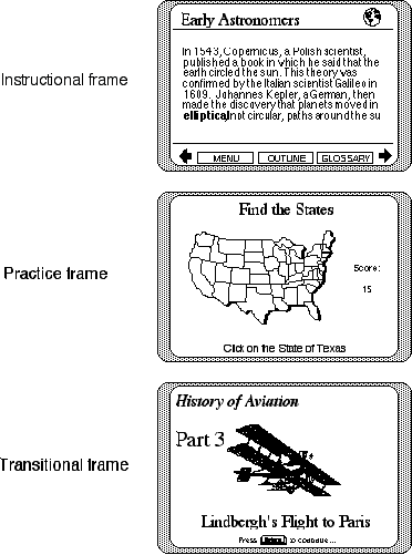
Figure 7.5
Examples of instructional, practice, and transitional frames in CBI.
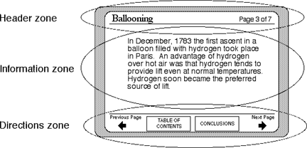
Figure 7.6
Examples of typical functional zones within a CBI frame. A "header zone" provides information about the relationship of the specific screen as it relates to the rest of the lesson. The "information zone" presents lesson content. The "directions zone" presents directions to the learner of what actions are required or available at this point.
Some screen zones can be further divided into subzones, such as an informational zone containing both pictures and words. Similar to print-based media, the zone can be split horizontally or vertically to present both the graphic and text, as shown in Figure 7.7. Given the interactive nature of computers, further information can be added or suppressed, via either program or student control. Additional information about the graphic or key words, such as labels, definitions, and examples, can be accessed through the use of pop-up windows available on command.
A recent phenomenon is software's heavy reliance on the use of graphical symbols (icons) instead of words for communicating software functions and options to users. There are obvious advantages to using icons. Icons don't take up much space and can be placed off to the side or periphery of the screen. Also, the graphical nature of icons can make it easy for a user to distinguish screen text from iconically based screen directions, hence reducing screen complexity and distractions. However, an icon's meaning must be absolutely clear to the user; often designers use very arbitrary symbols to convey complicated messages. Graphical symbols should be chosen very carefully so that even a first-time user recognizes the meaning at a glance. If no graphic can be found to satisfy this criterion, then a written label (with or without the icon) will be necessary. Designers often provide help options, which explain the function of screen symbols or options. While this seems like a good idea, help options are typically at least one level removed from the interface. Users may not even know that help is available. Of course, any icon that requires even a short paragraph of explanation is probably a clear indication that the graphic is a poor choice and should be changed.
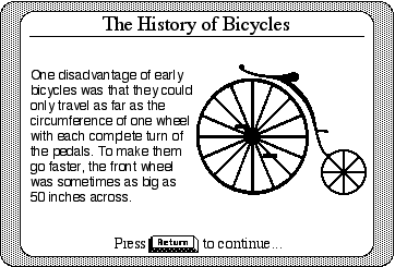
Figure 7.7
A frame protocol in which the "information zone" is split vertically to include both text and graphics.
Distribution of Emphasis
Whether designing instructional, question, or transitional frames, there will be a constant struggle to make the most important information jump out at the user, while having less important information remain unobtrusive, yet supportive. Therefore, there will always be a strong need to effectively direct a student's attention to the most relevant and salient information in the display. Other kinds of secondary information -- for example, screen buttons for options such as returning to a main menu, or available instructional aids such as glossaries -- should be, at best, in the periphery. This is especially true when graphics are used. The concept of distribution of emphasis refers to designing a frame so that a user is more likely to attend to the most important information and less likely to dwell on or be distracted by other information. Two approaches are typically used to increase a user's awareness of key information: cosmetic-based and information-based amplification techniques. Sometimes, as in advertising, these techniques are used in reverse to make critical information (such as the finance rate) as difficult to notice as possible, while complying with federal or state laws that require such information to be disclosed, such as that illustrated in Figure 7.8.

Figure 7.8
Does this look familiar? This illustration is based on actual automobile advertisements in local newspapers. Notice the interesting relationship between the largest and smallest typed words. The ad tries to capture your attention to the "invoice sale" in progress at this particular dealership. Most people think this means that the dealer is selling the car at their cost from the manufacturer, yet the small print indicates that "invoice may not reflect actual dealer cost." What, therefore, does "invoice" mean? Absolutely nothing.
Cosmetic-Based Amplification. Consider the experience of driving down the business district of a town where all the shops are competing for your attention. Some stores seem to jump out at us -- we can't help but notice them. Others (usually the ones we are looking for) seem to hide away as if camouflaged. Storefronts that capture our attention with creative signs and blinking lights, whether we like it or not, are practicing their own form of cosmetic-based amplification.
In computer software, cosmetic-based amplification techniques use surface-level graphical features to attract and direct attention to specific screen parts or text. Although a multitude of techniques can be used, each intends to provide contrast between various frame parts and subparts through obvious graphical cues. Such overt cues are designed to make some information stand out and to make other information fade into the background. Graphical features, such as different fonts, different font sizes, different font styles (e.g., boldface, italics, etc.) are most commonly used to highlight key text, such as important vocabulary or important phrases. Functional zones can be highlighted with borders. Animation, such as moving words and other objects, is also a favorite cosmetic amplification technique. Other techniques include using blinking lights, words, and objects designed to capture the user's fleeting attention.
The intention of all cosmetic-based approaches is simply to promote contrast between various screen information in order to take advantage of a person's natural tendency to notice that which is different from the rest. However, if cosmetic techniques are used excessively, users will become either numb to the barrage of displays or so distracted that they may choose to ignore much of the screen information. The best software uses cosmetic-based amplification techniques carefully and prudently. Again, the rule of consistency is important -- use the same types of techniques to convey the same sorts of information throughout the software. Consider the example of an on-line glossary. Software should always have the user perform the same action (e.g., click a button or keystroke) to trigger access to the glossary. The software should also use the same text format to show which words in a given paragraph are included in the glossary, such as boldface or color. Another common example is user directions, which should always be in the same screen location and be easily discriminated or separated from the rest of the information on the screen. Users will constantly be wondering "what should I do next?" or "what are my options at this point?" and will depend on a clear format to get this information.
Information-Based Amplification. In contrast to cosmetic-based amplification techniques, this class of amplification techniques uses learning strategies to amplify the most important or critical information (Hannafin & Peck, 1988). Repetition is probably the simplest technique. Repeating a key point or idea periodically throughout the lesson will help cue the user to the idea's importance or centrality. Other techniques include orienting strategies (similar to previews of what to pay attention to next) and review (summarizing the key ideas at the end of the lesson part). The old adage for preparing a speech -- "Tell 'em what you are going to tell 'em, tell 'em, then tell 'em what you told 'em" -- is an example of a simple repetitive strategy for making the message of the speech obvious and clear. Information-based amplification techniques can also include interactive strategies, such as questioning, to force users to focus on the most relevant information.
Any technique that uses redundant displays of the information, though in different form, constitutes information-based amplification. An example would be a picture that repeats or duplicates textual information. All of the pictures types -- representational, analogical, and arbitrary -- can be used in this way. For example, information in a passage of text citing highway fatality statistics over the past five years can also be represented in a pie chart or line graph. A lesson section devoted to Abraham Lincoln's Emancipation Proclamation can be accompanied by his portrait to amplify his role in authoring the document. An arbitrary graphic can be used to show the relationship between related concepts, such as how branches of the U.S. government interact, in order to supplement and complement a given text.
Procedural Protocol
Whereas it is relatively easy to design any one frame adequately, it is much more difficult to design a series of frames in such a way that they contain overt cues to their relationship to the program as a whole. Hannafin and Peck (1988) define procedural protocol as "the consistent use of conventions for lesson procedures, obtaining student responses, indicating the availability of lesson options, and prescribing other features that affect lesson use" (p. 178). In other words, procedural protocol provides all of the navigational aids a user will need to successfully complete the software.
Consider, for example, how a book's thickness, size, and weight possess information about it's overall length and scope. We tend to take for granted how a reader responds and reacts to a book's tactile cues. Any one page has an implied relationship to the beginning or end of the book. The idea of turning pages is so intuitive that no user instructions are necessary. In this way, a book can convey a variety of secondary cues to the reader. On the other hand, some navigational cues require overt attention to be of value to the user, such as how to read or use a table of contents, titles, subtitles, and indices. Unlike a book, any given single frame of computer-based instruction acts as the user's total interface with the rest of the program. Procedures of how to navigate through the lesson and participate in interactive strategies, as well as take advantage of other options, must be clearly communicated to the user.
The study of human factors, also known as cognitive engineering, corresponds closely with procedural protocol. As discussed in Box 7.2, Norman (1988) suggests that the three principles of visibility, mapping, and feedback must be carefully considered in the design of any interface between humans and an object in the world.
Software should make all relevant options and functions visible and plain. When a multitude of options are available, the functions should be stratified, so that only the most relevant options are in the user's perceptual view. But there should be "doorways" to second or third layers of options. Software should organize features in meaningful ways so that users do not need to deal with all options and decisions at the same time. For example, the option to increase or decrease the size of printed output could be nested within a "print" function, which, in turn, might be further nested within a group of "file" functions. This may be less an issue in structured CBI packages where users are frequently led down only one learning path. However, in unstructured packages, such as hypertext stacks, the risk of disorientation is great, despite the flexibility of the software.
Users should be given conceptual maps, such as outlines, to help guide their explorations and decision-making. Users should be completely confident about where they are in a software package, where they have been, and where they may be going. The range of allowable actions should constantly be evaluated against the range of goals a user may have at any given moment. Once a user defines a goal, the amount of time and effort that must be expended in order to execute an action to meet the goal should be minimized. (Recall from Box 7.2 that Norman [1988] refers to this difference between a user's intentions and the system's allowable actions as the gulf of execution.)
Computer specialists have come to tolerate cryptic and abstract interactive strategies, such as those involving a keyboard. Other input devices, such as the mouse, light pens, touch screens, and voice recognition, are beginning to reduce the level of abstraction to which computer systems so far have been prone. A goal of "putting the red ball in the blue box" is trivial in the real world, yet can be an exercise in frustration for a similar simulated action on a computer screen. The principle of mapping is simply the degree of relationship between two things, such as a screen button of a right arrow and the function of going to the next page. Mapping is an important tool in helping to be sure users can quickly complete an action sequence, whether their goals are simple (i.e., go to the next page) or complicated (i.e., mix chemical A and chemical B to produce solution C). The range of available input devices should be considered (including, but not limited to, the keyboard). Computer systems should use "natural mapping" in their designs where the action sequence is concrete and mirrors how actions would be executed in the real world. Natural mappings are important, whether one is designing an aircraft instrument panel (Hicken, 1991) or a computer "book," where one clicks on the right side of the screen to go to the next page or on the left side to go to the previous page.
The widespread availability of the computer mouse has made it easier to design simple user interfaces. Though not as concrete as some input devices, such as touch screens, even novice users seem able to master the "point and click" technique with only minimal experience. The most common mouse strategy is for the user to interact with the system through screen buttons. However, the mere use of a mouse and buttons does not guarantee that an appropriate procedural protocol has been designed.
Buttons seem to be the most effective as interfaces between a lesson's procedural protocol and the user when the button is based on a concrete concept (see chapter 2). The advantage of using concrete concepts as navigational aids (whether representational or analogical) is that they are memorable and can easily be depicted in graphical form, such as screen icons (as introduced in the last section). Whenever possible, use simple and intuitive representational graphics in designing screen buttons, such as a picture of a printer to convey print functions, so that users know at a glance the function of the button. Use an analogy if no direct graphical representation of the concept exists, such as a picture of a tree to denote the "branches" of an outline or menu, or a picture of a "football coach" to denote how to get help, advice, or other coaching. Computer systems frequently use concrete analogies, such as "file folders" for subdirectories, to convey abstract ideas in meaningful ways to novice users.
Feedback is an essential element of procedural protocol. Users need simple and direct feedback as they interact with the software to let them know if an intended action has been completed. Once users complete some action sequence, the system must tell the users if they have been successful. (As discussed in Box 7.2, Norman [1988] calls this gap between what a user intended to do and knowledge about what actually happened as the gulf of evaluation.)
Software should take into account a variety of learners with a variety of needs and situational conditions. Software should reward users for an exploratory attitude. Likewise, software should not penalize users for making mistakes in their attempts to navigate through the software. Navigational mistakes, when made, should be easily detected and remedied by the users.
Finally, when all other design efforts fail, the last resort is to standardize a function, such as the example of using a special key or button to back out of a function. Again, consistency is very important. Students will usually begin to pick up on well-designed procedural protocols just by use. Once a designer determines the placement and function of various screen locations (functional zones), care should be taken not to inadvertently change these and any deliberate changes should be carefully and cautiously made. Users need to be able to accurately predict what they are able to do and how to do it all along the way.
The concept of transparency, as discussed in chapter 1, is an important benchmark in evaluating both frame and procedural protocol. The better frame and procedure protocol are designed, the more likely the user will not notice them. Instead, the user can focus on the lesson's ideas or activities. This creates a type of seamless software design, such that there is no obvious distinction between using the software and knowing how to use the software.
Some Basic Principles of Graphic Design
Despite the resistance here to entering headlong into the world of graphic design, there are some generally accepted issues and concepts related to visual layout that are relevant at this point. Even the most specific design principles can be traced to one of four broad categories of visual design and layout: simplicity, unity, emphasis, and balance. In a sense, these principles aptly summarize much of the previous discussion of frame and procedural protocol. All four categories can be supported and described on the basis of human perception and information processing discussed in chapter 4. For example, visual layout should take into account a person's abilities and limitations in selectively perceiving the most important information in a given display. All information coming from the environment will be competing for a person's limited attention. Therefore, a display should be designed to maximize the chances that a person will notice the most relevant quickly; it should also be able to sustain user attention over a period of time. When combined with rapid prototyping procedures and a lifelong hobby of "software watching," these principles can help guide beginners in designing effective screens.
An easy way to understand the importance of these four principles is simply to consider the effect of their opposites -- complexity, disorganization, sameness, and imbalance. For example, it is difficult for most novice designers to resist the temptation to fill a given display area with as much information as possible, as though the display were like a refrigerator shelf. The simpler the design, the easier it will be for a person to quickly scan, interpret, and extract meaning from a display. The most important information should be readily discernible. This does not necessarily mean that the user is released from the responsibility of studying a frame of instruction. However, if the user is expected to take sufficient time reading a block of text, the perceived demands of the task, such as reading, should be obvious to the user, both in terms of time and effort. See Pettersson (1989) for more specific information about the graphic design of instructional visuals.
Color and Realism as Instructional Variables
There is something intuitively appealing about using color in the design of instructional materials. It is tempting to believe that learning must be a natural consequence of the strong visual sensation often provoked by color. (See Footnote 3) Therefore, it seems obvious that merely adding color to a given display should increase learning. Given the ubiquitous nature of color in the natural world, it is easy to believe that if one wants to learn about the world in some way, then color should play a role. Educators often criticize instructional materials solely because they lack color. (See Footnote 4)
Once again, what appears to be an obvious truth is complicated and clouded by the fact that color is simply one of many variables that must be considered in instructional design. For simplicity, we will discuss the use of color in instructional displays in the context of the two families of instructional functions introduced in chapter 2 -- affective and cognitive. This should help us to better understand whether or not evidence, speculation, and intuition agree regarding the design of color. Simply understanding the differences between affective and cognitive functions of color and realism can be a monumental first step for designers and can help prevent creating well-intentioned displays that interfere with learning. The discussion presented here is offered as a doorway to understanding the issues that are unquestionably more complicated than their relationship to only these two functions may suggest.
The appeal of color graphics, by definition, is directly associated with affective or motivational considerations. However, most of the available research is concerned with using color in direct instruction, as opposed to motivation. Even here, research on using color for cognitive functions has largely been inconsistent and inconclusive (see Dwyer & Lamberski, 1982-83, for a review). In general, color, in and of itself, does not seem to be a critical variable for instructional tasks. At best, color serves only a secondary instructional purpose, such as cueing or directing a learner's attention to some critical feature in a display. Color can be an effective amplification technique by helping to bring important information to prominence. Even here, it is not color per se that makes a difference, but the potential contrast that color provides (Goldsmith, 1987).
Closely related to the use of color is realism, or the degree to which a pictorial representation resembles an object in the world (Dwyer, 1978). The concept of realism exists on a continuum ranging from representations that cannot be distinguished from their real-world counterparts to the most abstract representations of objects, such as printed words. Consider a picture of a goldfish in an aquarium. The most realistic representation would confuse a person into believing that the picture really is a fish. All of the visual cues associated with a goldfish, such as color, texture, depth, motion, and reflected light shimmering on the water, would offer no visually perceptible differences between the representation and a real fish. The truest representation would need a high-resolution, animated holographic 3-D image. Less realistic (because some of the visual cues, such as motion and depth, would be missing) would be a high-resolution color photograph. Someone might mistake the photograph for a real fish at first, but would soon realize that it is only a picture.
As with color, it is tempting to say that effective instruction should contain a high degree of realism, without fully understanding or recognizing the intent or function of the visual. Visuals used for cosmetic or motivational functions will have entirely different design assumptions than visuals designed to teach or instruct. Recall that by instructional, we mean that the visual's purpose is usually to communicate a fact or intellectual skill (such as a concept or principle, or aid in a person's problem solving). As discussed in chapter 5, Dwyer's (1978, 1987) research suggests that visuals designed for a cognitive task that contain either too little or too much realistic detail adversely affect learning, especially when learners do not have control over the pacing of the visual presentation, such as video. Dwyer's research has shown that students may have difficulty identifying and attending to relevant information in a highly realistic visual, such as a color photograph. For example, realistic details (including color) can interfere with a student's ability to recognize and understand critical features of a visual.
However, when the intent is motivational in nature, it can be argued that color and realism are important attributes to consider. The next time you go to a bookstore, reflect on your browsing patterns. See if you are more likely to browse longer through a book that contains an assortment of interesting visuals, especially those with color photographs. Of course, browsing behavior is not instructional in nature. You are not trying to read the book for meaning when browsing. On the other hand, you definitely will not learn anything from the book unless you first open it up and spend time with it. Therefore, it can be suggested that color and realism might serve to affect one's choice to engage in a learning behavior, and subsequently, to choose to persist in the activity. This may be true even though accompanying visuals offer no direct instructional value. Some research has shown that student preferences and expectations for visuals that differ in the amount of realism (i.e., video vs. computer graphics) may influence the effectiveness of the technology more than direct instructional uses of these visual characteristics (Acker & Klein, 1986).
There is no reason not to use color and realism when they are used solely with the intent to increase the motivational appeal of instructional materials and when, of course, they do not undermine the effectiveness of other instructional variables. However, even this relatively bland recommendation is made cautiously, as no substantive research is available to support the argument that color and realism directly increase the motivational appeal of materials (see Surber & Leeder, 1988).
Given the decision to go ahead and use color in instructional materials, we still are left with all of the graphic design issues of how to use color to create appealing and motivating materials. Again, this book does not presume to teach graphic design, although it is, of course, related to instructional design -- poor graphic design of materials can easily undermine what would be otherwise appropriate instructional design. As a beginning guide, Box 7.3 offers some good advice on the use of color. Here are some general design principles related to color:
|
|
|
Color is probably best considered a secondary graphic element in the design of instructional materials. That is, the effect of color on learning has not been shown to be particularly potent. This simply means that there should be little expectation that color, in and of itself, will lead to greater levels of learning. In fact, the greatest role of color may simply be in supporting other instructional elements, such as a cosmetic-based amplification technique to help gain a learner's attention to important screen information. Color use should not be avoided, but nor should it be used indiscriminately, as poor color choices have a high potential for distraction. Although the research is vague, there is some reason to believe that color may play an important role when designing materials with affective or emotional learning goals. The following is a synthesis of the literature related to the use of color in graphic design, including, but not limited to instructional applications. This set of design principles was created by Evelyn Wells. 1. Do not use color indiscriminately. Color can enhance the appearance and function of your project, but only if it is used properly. Incorrect color use can significantly detract from the effectiveness of your project. 2. Consider color as an aesthetic and cognitive design tool during every stage of your design. If you reduce color to only a cosmetic afterthought, you will miss out on all the advantages it could give you. 3. Limit the use of different colors. Exercise simplicity, clarity and consistency. Make sure you have a reason for each color you use, and how you use them. 4. Do not rely on color alone. Color is best at redundantly emphasizing information. Other design elements (text, shape, layout, fonts, etc.) should carry the bulk of the information, and work in tandem with color. Your project should still be usable if converted to a monochrome format. 5. Try to work in the same conditions in which your project will be used in final form. Many factors can change the appearance of colors. Even worse, the change is not uniform for all colors. Variations in ambient lighting (fluorescent, daylight, darkness) and media transfer (print, video, film) can have a drastic effect. Also be aware that screen layout dynamics will cause colored elements to change in relative size and position, which will affect their appearance a great deal. 6. Experiment, experiment, experiment. Do not underestimate the potential of color. Consider alternative color schemes and consult with potential users of your product and your colleagues. Examine other products (in your field, and in everyday life) and become aware of how color is used. 1. Group categorically related elements with the same color. Emphasize relations between elements on the same screen, or on successive screens, by coloring the elements or their backgrounds with the same color. For example, in a hypermedia document, all words which link to the glossary could be colored blue, and all words which link to a video segment could be colored green. Do not use the same color for elements which are not related. Even if the elements are not viewed at the same time, they could be subconsciously linked. 2. Use similar colors to denote relationships between elements. Relationships, such as chapter and section hierarchies, can be represented by choosing colors that systematically vary in a dimension such as hue or saturation. The degree of change (such as dark green for a chapter heading, medium green for a section, light green for a subsection) can indicate the strength of the relationship. 3. Link color change to dynamic events. Changing color (from green to yellow to orange to red, for example) can portray elapsing time or other critical levels. Changing color is also good for dynamic data visualization. 4. When using colors for coding information, use a maximum of 5 +/- 2 colors. Human memory for color is even less than the "magical number 7+/-2" accepted for memory of units such as digits and words. If your users must remember and recognize colors, use only 3-7, and make them as distinct and meaningful as possible. 5. Use extremely bright and saturated colors only for special purposes. These colors immediately draw attention, and should be used sparingly, and only for the very most important parts of the design. They are useful for error messages, urgent commands, key words, or some introductory information. For the rest of the content, give the most important elements the most contrast with the background. 6. Use "temperature" of colors to indicate action levels or priorities. Warm colors (red, orange, yellow) tend to advance from the image and imply action or a required response, while cool colors (purple, blue, green) tend to recede from the image and imply rest or background status. 7. Use logic in choosing meaningful color schemes. Color schemes based on the ROYGBIV spectrum are often naturally understandable by most users. However, you should take advantage of colors conventions which have cultural or application-specific meaning, such as using red for unpaid bills, or using pink for female children and blue for male children. 8. Be aware of the social connotations of colors. Colors carry meaning individually and in combinations. For instance, blue can mean masculinity, death, water, or coldness, and red, black and white are often associated with Nazi Germany. Choose colors with your audience in mind. 9. Use the same colors for all aspects of your project. Aid the users of your product by consistently using the same color scheme for all documentation: support materials, training, testing, and advertisement. Again, be aware of the color change when transferring across media. 1. Do not use highly saturated, spectrally extreme colors simultaneously. The focus of the eye changes according to the wavelength of the color, and spectrally extreme colors cause frequent refocusing which may in turn cause visual fatigue and afterimages. Avoid juxtaposing colors such as red and blue or yellow and purple, or use them only in desaturated forms. 2. Use blue for large background areas, but not for text, thin lines, or small shapes. The eye is not sensitive to blue in the foveal (center) portion of the retina, where detailed vision occurs. This makes it hard to discriminate small blue shapes, especially for pure shades of blue. However, blue makes an ideal background color. 3. Use red and green for central colors, but not for background areas or for small peripheral elements. The eye is insensitive to color in the periphery, especially to pure reds and greens. If these colors must be used for elements in the periphery, use high contrast or blinking. 4. Avoid adjacent colors which differ only in hue. Because edges are mainly perceived through brightness gradients, adjacent colors should always differ in value as well as hue. Blue does not contribute to the perception of brightness, and edges created by a difference in blue only will appear especially indistinct. 5. Consider the final viewing environment. In general, use a dark background with light elements (text, etc.) for dark viewing conditions (slide presentations, etc.) and a light background with dark elements for light viewing conditions (paper, normal computer use). Contrast is the most important factor in text legibility. 6. Increase the brightness of the display for older operators. With age, the eyes loose much sensitivity. The overall brightness of the display should be increased, and color contrasts will need to be enhanced. 7. Avoid single-color distinctions. Color deficient vision (color-blindness), which occurs in about eight percent of the male Caucasian population, stems from the partial or complete dysfunction of either the red or green (and occasionally the blue) photoreceptors in the retina. Colors which vary only in their amounts of red or green will be hard to distinguish for color deficient viewers. Again, colors should vary in at least two of the three primary colors, and subtle differences should be used with caution. |
FUNCTIONAL DESIGN RECOMMENDATIONS FOR INSTRUCTIONAL COMPUTER GRAPHICS
The final section of this chapter summarizes many of the issues discussed in this book related to the use of graphics in designing instructional materials. This section presents general design principles based on four of the five instructional applications of graphics introduced in chapter 2 -- cosmetic, motivation, attention-gaining, and presentation. These principles are relevant to both static and animated graphics. The fifth application -- practice -- is the topic of the next chapter, which will address the design of highly interactive learning environments on the computer and especially the use of animated graphics as visual feedback. As discussed in chapter 2, these five applications are not mutually exclusive and frequently overlap.
There are a few general instructional graphic principles that apply to all materials. These are followed by principles specific to each of the four instructional applications.
1. There are times when pictures can aid learning, times when pictures do not aid learning but do no harm, and times when pictures do not aid learning and are distractive. This is the "first principle of instructional graphics," as presented and discussed in chapter 1. Its obvious message is repeated here as a reminder that graphics are not innocuous variables to be casually included in instructional design, but must be given careful thought and planning. The intent and outcome of graphics should be considered and evaluated throughout the instructional design process.
2. Select the type of visual based on the needs of the learner, content, and the nature of the task. The type of visual used (representational, analogical, arbitrary), as well as the instructional function it serves (cosmetic, motivation, attention-gaining, presentation, practice), should be selected and designed based on the interplay of three variables -- learner, content, and task. It must be remembered that not all people learn in the same ways, nor do they all have the same interests, backgrounds, or experiences. Different content or domains (i.e., the material to be learned) demand different considerations when it comes to visuals. Also, the nature of the task, as defined by one or more strategies suggested by Gagné's events of instruction, and the delivery system (i.e., individual, small group, large group, distance learning, etc.) must be taken into account. All of these instructional variables, of which visuals only contribute to, must be congruent and consistent with one another.
3. Graphics should not distract attention from the lesson goals or objectives. The best guide to what should be achieved in the lesson is the lesson objectives as determined through instructional design procedures -- whether those based on traditional ISD or rapid prototyping. Unless one knows what the goals are, there will be no way to know if the goals have been met.
4. Graphics should be designed carefully to serve their appropriate function. Graphics should be designed as an integral part of an instructional design, not as an afterthought. Deliberate attention should be given to what type of graphic is chosen and the function it serves as it relates to the overall design. The component parts of a lesson, whether based on Gagné's events of instruction or another model, should complement and support each other. For example, once a deliberate decision is made to use a line graph to show the relationship between economic growth of two countries over a five-year period, design efforts should go toward accomplishing this goal. An effort should be made to resist using the graph for other reasons, such as cosmetic. When the graph has served its purpose, it should be removed and the lesson should proceed. It also goes without saying that graphics should not depict or promote cultural, ethnic, or gender stereotypes.
5. Be extremely cautious in the use of cosmetic graphics in the design of instructional materials. Cosmetic graphics, by definition, do not carry any instructional value. The intent of cosmetic graphics is simply to make the materials more attractive and polished. There is inherently nothing wrong with this, and there is no reason why instructional materials should be drab and boring, but there is always the danger that frilly graphics may distract a learner's attention from the instructional message. The best advice is to design cosmetic graphics with a true motivational purpose. In other words, design graphics that at least have the primary intent of motivating students and that secondarily give the software a finished, polished, or commercial quality.
6. Make design decisions related to the use of cosmetic graphics early in the process and include such graphics in the evaluation of the final materials. One worst-case scenario is when cosmetic graphics are added after all the time and effort has been spent in designing, developing, and evaluating quality instruction, again solely to satisfy some estimate of commercial quality." Not only is the risk high that these graphics may disrupt the effectiveness of the instruction, but the designer may never know of this influence since all evaluation procedures will have long since concluded. At the very least, summative evaluation should not occur until the materials are in final form -- and final form means final form.
Some common cosmetic graphics include the wide array of backgrounds, such as those that simulate pages in a book or note pad, television screens, or text etched on simulated marble slabs. Designers also commonly use "glitzy" transitions, such as one screen sliding in front of the previous. Rather than only consider these as cosmetic features, designers should seek to use these transitions in ways that help users understand the flow of information. For example, the screen transition of "slide left" (where the next frame is "slid" from the right of the screen toward the left edge of the screen, covering up the previous frame as it moves) could be used to simulate the natural mapping of "future pages come from the right." Similarly, going back to a previous page should use "slide right." If a special glossary screen is available, the transition effect "slide down" could be used when accessing it, only to use "slide up" when the user is finished with it. This helps build the concept that such extra information is "above," waiting to be used, and is "put back" when finished. In this way, designers can use such simple effects for cosmetic, motivational, and instructional applications simultaneously.
7. Use graphics to increase motivation and interest, but be careful to avoid distraction effects. Motivation is a popular reason or rationale that designers often cite to justify using graphics. As discussed in chapter 3, there are two principle types of motivation: extrinsic and intrinsic. Although there is nothing wrong with using graphics to increase the extrinsic appeal of the lesson through the use of pretty pictures, designers should seek to creatively use graphics to increase the intrinsic appeal of the lesson through the use of graphics (as per the next recommendation). A common application of motivational graphics, especially in instruction meant for children, is personified cartoon characters (such as "Mr. Tooth" explaining the importance of dental care). Of course, the use of graphics solely for motivation excludes their real power to communicate, to inform, and to provide feedback.
8. Use graphics to present meaningful contexts for learning and to increase the intrinsic motivation of the learner. Probably the best use of realistic graphics, such as photographs and especially video, is in triggering strong emotional and affective responses in people. Therefore, one of the best motivational uses of graphics may be in stimulating a learner's fantasy and imagination through powerful visual displays. Video sequences, such as a shuttle lift-off, the beating of civil rights demonstrators, or the spectacle of a passing tornado, can help create real reasons for a learner to participate and persevere in the mathematical, social, or scientific issues about to be introduced and discussed. Once again, the graphics are used for a specific purpose to complement and supplement the entire instructional system.
One strategy that can overlap motivational, instructional, and even cosmetic functions of a given graphic is the use of photographic images of an event, including portraits, to complement the verbal accounts of the event. This use might be termed the "Life magazine effect" and refers to the intrigue that a photograph can stimulate while one is reading or listening to the event to which it is related. A photograph of Abraham Lincoln's face does much more than words to capture his essence in an article about America's Civil War. Again, designers walk a fine line between using the graphic to instill a sense of the emotional quality of how one person affects history and distracting the reader or viewer from the details of what the person actually did.
9. Graphics can be an effective attention-gaining device. Surprisingly, little direct research is available on the use of graphics for attention-gaining and much of that is dated (see Dwyer, 1978). However, there seems to be consensus among developers that graphics can be used to draw students' attention to the instructional materials. That said, the following principles related to attention should be used to guide the design of graphics for attention-gaining and attention-sustaining purposes.
10. Attention is a highly selective and controllable process (Fleming, 1987). As discussed in chapter 3, the limitations of selective perception and short-term memory require an individual to focus on only a limited amount of information at a time and block out other incoming stimuli from the environment. Attention-gaining graphics should be designed to pull learners back to the instruction in general and to a task in particular. The graphics (and the rest of the lesson components) will constantly be competing with other sources of information (such as other incoming stimuli from the environment and the person's prior experiences). The graphics should give students a reason to attend to the lesson information, either because of the graphic's visual appeal or the meaning that the graphic may hold for the learner. Similarly, a learner's expectations can strongly influence attention.
There is an important relationship between attention-gaining and presentation principles associated with graphics. Even though a graphic may be used to present information, learners often do not know how or when to use the information contained in the graphic. This is a problem related much more to selective attention than how to present the information graphically. Certainly, students will not learn anything from a presentation graphic unless they first attend to it. One strategy to increase the chance that students will attend to a graphic is to provide students direct and overt directions to actively search for or use specific information in the visual. In this way, the strategy overlaps attention-gaining, presentation, and practice functions. Unlike other media, such as print-based, computers afford a variety of interactive strategies. Designers should take advantage of these.
11. Attention is naturally drawn to what is novel or different. An enemy to attention-gaining includes any monotonous stimuli. Screen after screen of text will soon make even the most motivated individuals lose their ability to focus on the message. Even presenting small changes occasionally will help attract and maintain attention. In CBI, transition screens between lesson parts can help to not only provide markers to students as they complete a lesson, but also help to break up even short series of presentations. Contrasting screen elements, such as animated objects, can also help attract attention.
However, do not confuse this principle with those associated with graphics used to present or communicate information. Although a complex graphic may gain or attract a learner's attention, the learner subsequently may be quite unable to extract any meaning from the graphic. So, while the graphic may have been successful in gaining attention in general, excessive realism may distract student attention from the specific (or essential) information contained within the graphic.
Presentation Graphics
12. Graphics should be congruent and relevant to the accompanying text, or distraction may result. This is probably the most fundamental principle associated with using graphics in presenting information that is supported by the research on both static and animated visuals (see chapters 5 and 6). Using graphics as part of presentation strategies is the most direct use of a visual for instructional purposes. Presentation graphics should be carefully designed to convey only the information intended, and adding any further visual details should be avoided. The most salient and critical features of the graphic related to the information should be clearly distinguishable to the learner. The graphic may be used as the primary carrier of the lesson information or may be used to supplement the verbal information (whether textual or aural). Animated displays should be used to present information that changes over time. Such changes are usually operationalized through either the attribute of motion or trajectory (path of travel), or both.
13. Students should be cued to process the information contained in a graphic in some overt way. This principle complements the attention-gaining principle (#10) above. The most well-designed graphic will be totally useless if the learner does not first attend to the visual and then consciously use the information in the visual in some way. Most designers assume that the learner will be visually literate enough to know what to do with the visual, when this may not be the case. Part of the problem is that designers become so close to the instructional materials that they can lose touch with the learner's point of view. Rather than assume that a learner will instinctively know how to interpret the visual's information or leave it to chance, the lesson should be designed to have the learner interact with the visual in some way.
Some interactive strategies may seem more related to practice than presentation, but this is not an important issue. A presentation strategy may simply be to rhetorically ask a learner to "look and see (from a graph) how many bushels of wheat were produced in America last year and compare it to 1960." A true interactive lesson strategy on the computer would force the learner to input the information. Interaction during the presentation of information would conform to learner guidance (Gagné's fifth event of information), since it is aiding the learner in attending to and selecting the information as it is presented. Practice strategies are more related to the rehearsal and application of information once it has been taught.
14. Graphics are unnecessary when the text alone produces mastery. Despite some of the advantages and appeal that the addition of external visuals may carry in instructional design, it should be remembered that a well-constructed verbal message, whether textual or aural, may sufficiently cue a learner to internally form appropriate mental images. This is the "master story-teller" phenomenon discussed elsewhere in this book. In addition, as the research indicates, the reliance on external visuals may decrease with age. Therefore, using pictures and other graphics may be less necessary with adults than with children. Of course, the graphics may still support the learning, although no additional effects on performance may result from their use. As some of the research with animation has indicated, the graphics may be helping the encoding and retrieval processes (as evidenced by response time), even though no additional learning seems to be occurring (see chapter 6). Of course, such graphics may also provide some motivational incentive to students, even though some distinctive instructional value of the graphics may be questioned. Also, the instructional value of spontaneous internal imaging depends heavily on the context. Internal imaging may be sufficient in the comprehension and inference of a story, but may be totally insufficient in learning technical information, such as how to change a flat tire.
The use of graphics for attention-gaining and presentation purposes, though appropriate and practical, does not come close to the potential of computer-based applications of instructional graphics. Of the many strengths associated with the computer as an instructional medium, its interactive capabilities represent the richest and most exciting areas for instructional design and development. As yet, these capabilities remain largely unexplored and much of the potential remains untapped. In this book, the term "practice" is broadly defined as any strategy in which the learner interacts directly with the content or domain. The potential of graphics in practice strategies can be essentially reduced to their role as immediate visual feedback. The computer's ability to quickly process student input to provide moment-to-moment visual feedback (i.e., animation) extends beyond the utility of immediate feedback to questioning techniques and into the realm of artificial worlds where learners do not just study the material, but begin to live it. In this way, intrinsic motivation and practice become intertwined. The next chapter is devoted to this topic.
Here are some of other, more radical paper plane designs as referred to in Box 7.1. The top design is call a "flying wing" and when properly constructed is a superb glider. The paper plane below is based on the "ring wing" design by George Allison of the NASA Langley Research Center. This latter design is supposedly only half the weight of a conventional airplane, but with the same payload.